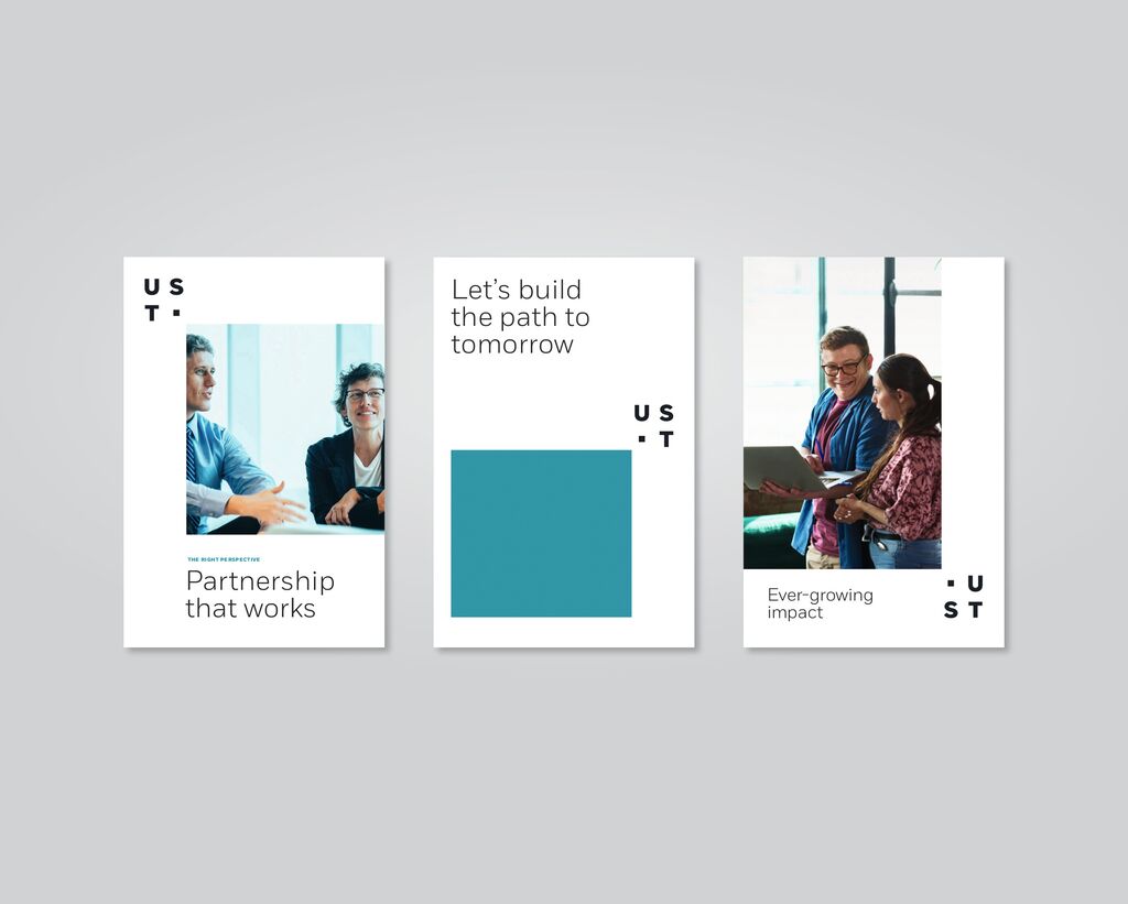
Brand Design

aibo

Back Download

The dog-shaped aibo entertainment robot provides users with a companion to connect with. The brand, including the logo, has undergone an overhaul which reflects the progress made over the recent five generations of these robots. The focus in this process was on the dog’s vitality. The brand design, based on circles evocative of aibo’s physical shape and round eyes, speaks at an emotional level and is programmed to change continually. In order to give the brand a sense of uniqueness, even the logo changes constantly. For the website, a program is embedded which also reflects the permanently changing identity of the brand. Last but not least, pink was chosen as the brand colour, which enhances the emotional appeal and express affection.

Red Dot

Others interested too