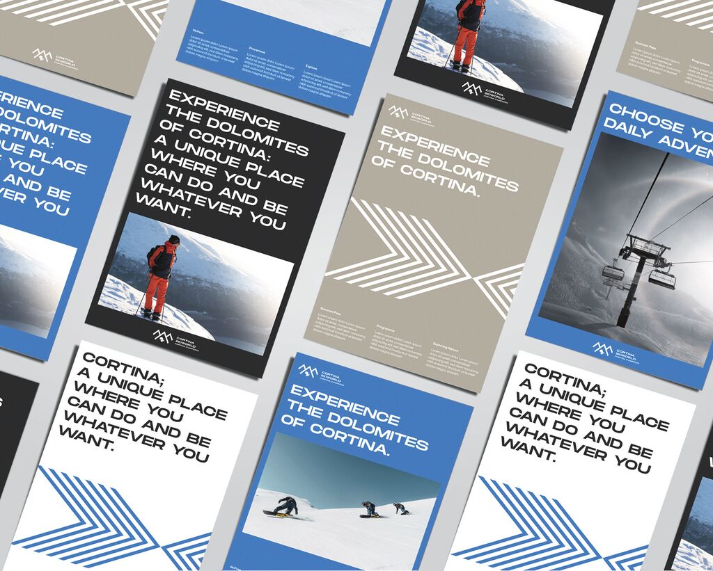
Brand Design Relaunch

BMW

Back Download

For the first time since 1998, the logos, corporate font and colour system of BMW, BMW M and BMW i were redesigned. The use of these basic elements was liberated, resulting in shorter, simplified user guidelines. The BMW symbol received an overall simplification and replacement of the black ring with a transparent area. The sub-brands were aligned accordingly. The new corporate font increases readability, is more characteristic and thus strengthens the visual identity. Along with new colour specifications, simple corporate design principles offer high adaptability.

Red Dot

By starting the video, you agree that data, e.g. your IP address, will be sent to Vimeo. vimeo.com/privacy

Others interested too