The German state of Baden-Württemberg started a local public transport initiative in 2017 with a campaign to improve its railway service quality and start the operation of more than 250 new trains. The aim of the initiative is to create a sustainable mobility culture and to double the local transport passenger figures by 2030. Since Baden-Württemberg’s transport infrastructure is very heterogeneous and its services are provided by 22 associations and 50 transport companies, including 20 rail transport companies, a new public transport umbrella brand was to be developed to pool all services provided by the public authorities and all the transport companies in the region.
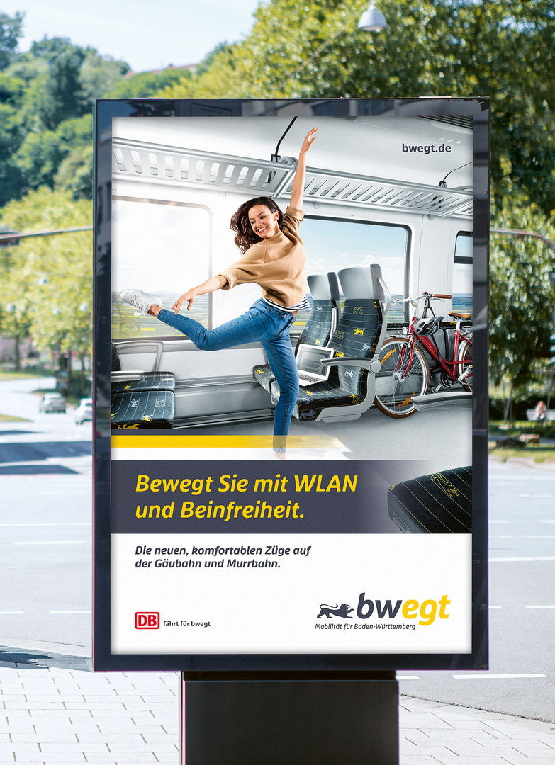
The key idea behind the umbrella brand bwegt is to offer people in Baden-Württemberg a new freedom of movement and thus to motivate more people to rely on local public transport. The word mark bwegt is made up of the acronym BW for Baden-Württemberg and the key term “bewegt” (moved, transported) as the guiding principle of a new mobility in the region. The logo mark consists of the brand name “bwegt”, the heraldic animal of the state and the claim “Mobilität für Baden-Württemberg” (Mobility for Baden-Württemberg), while using the state’s crest colours, black and yellow, as brand colours. Moreover, a corporate typography with a specially developed typeface was created as part of the new brand image. The so-called bwegt swoosh, which is reminiscent of the side view of a passing branded train, has emerged as another recurring design element. The corporate design is applicable in printed and digital media, as well as in the design of trains and ticket machines.
Movement both literally and in the figurative sense of touching is also placed centre stage in the campaign’s motifs and moving images. Photos and videos were created in close cooperation with the company of choreographer Eric Gauthier in order to express the idea and vision of movement in dance and capture it in images. This lends the public transport brand an aesthetic and emotionality that is unusual and very unique for the industry, which in turn leads to a high level of recognition: within two years, public awareness of the brand rose from zero to 38 per cent, and the brand is being associated predominantly with the notions of “dynamism”, “modernity” and “sustainability”.
Credits
Company:
Ministerium für Verkehr Baden-Württemberg
Founding Year:
2017
Lead Agency:
Statement GmbH Agentur für Marketing- und Designlösungen
Saarbrücken, Germany
Beaufort 8 GmbH
Stuttgart, Germany