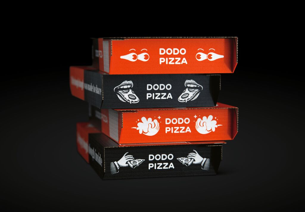
Brand Design Relaunch

EGGDROP

Back Download

The design of the new signet for EGGDROP combines the smooth curve of an egg with a simple graphic element. Symbolising the company’s various locations in the city, the designers adopted a city grid pattern that adds texture to the brand design. The use of black, white and red as primary brand colours aims to embody vibrant city life. A secondary colour palette is applied to distinguish between the products and to convey the characteristics of the menu. As part of the visual identity, the packaging, digital applications, design of the uniforms and interior design of the stores deliver a highly distinctive brand experience.

Red Dot

By starting the video, you agree that data, e.g. your IP address, will be sent to Vimeo. vimeo.com/privacy

Others interested too