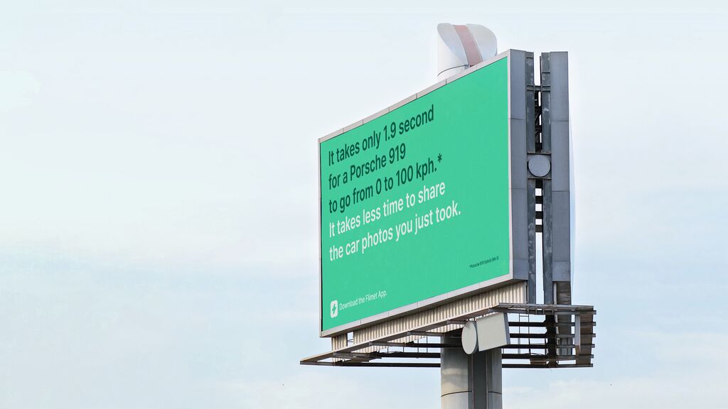
Brand Design

Flowering Street

Back Download

To help homeless people in London, this charity project promotes the idea that the homeless earn money themselves by selling flowers in the streets. The brand logo is inspired by street signs of London, recalling the issue of people sleeping rough, while the slender, elongated font references the shape of flowers. A bolder version of the same font is used on posters, paired with emotionally appealing portraits and the brand’s main colour orange. Considering the dreary experiences many homeless have had, the design employs a less saturated shade of orange, which spreads a slightly subdued mood.

Red Dot

Others interested too