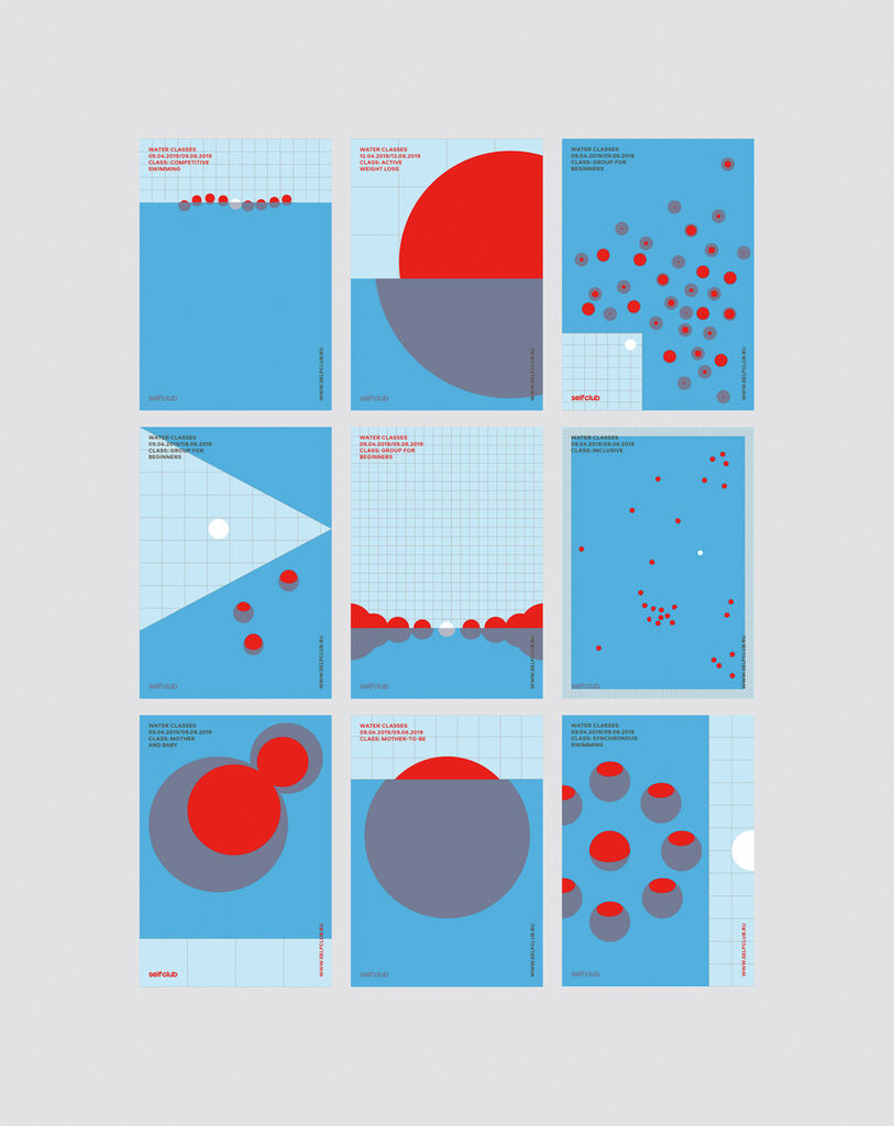
Poster Series

Livsdal

Back Download

This poster series visualises the graphic identity of the Swedish company Livsdal. Symbolising the company’s competence in the field of air purification, the logotype consists of small dots evoking a refined and clear appearance. The posters display Livsdal’s “alphabet of dots”, which is recognisable across all of its communication materials. Every poster showcases a distinctively spirited signage of dots. These energetic and clear-cut dots create vivid images, further enhanced by the sharp, contrasting colours of orange, black and white.

Red Dot

Others interested too