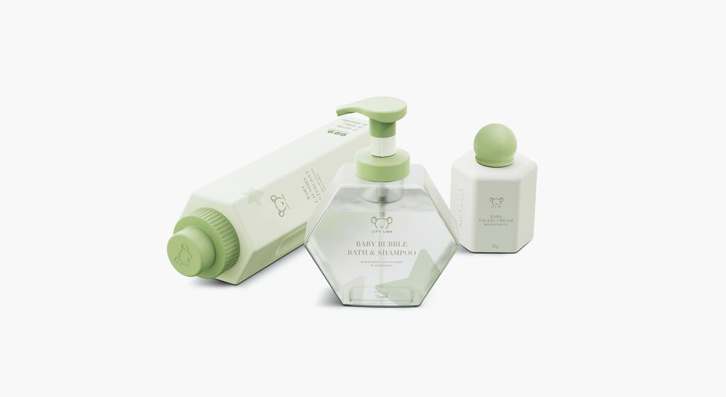
Coffee Packaging

Max Hase

Back Download

The Max Hase packaging design focuses on visually differentiating between pure coffee flavours and blended varieties. For the former, the country of origin takes centre stage, while a stylised postal stamp reveals the name of the plantation. Additional information about the coffee’s growing region, characteristics and flavour is summarised on the reverse side. The blends, in turn, visually reference the company name, which means “hare” in German, and also feature a sparkling hologram foil. On the back, short humorous stories reveal the occasion for which each blend was created.

Red Dot

Others interested too