Red Dot Gala: Product Design 2025
Start Livestream: 8 July, 5:45 pm (CEST)
Watch our YouTube Livestream
00
days
00
hours
00
minutes
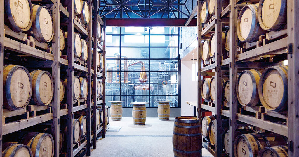
Nozawa Onsen Distillery
Back
Download
Credits
Brand Owner
:
Nozawa Onsen Distillery
Founding Year
:
2022
Company Founder
:
David Elsworth / Philip Richards
Number of Employees
:
10
Claim
:
TASTE THE SPIRIT OF NOZAWA
https://en.nozawaonsendistillery.jp/
en.nozawaonsendistillery.jp
Others interested too
Red Dot Award: Design Concept 2016 – Call for entries to begin 1 January 2016
Red Dot Award: Design Concept 2024 - Call for Entries
Kia