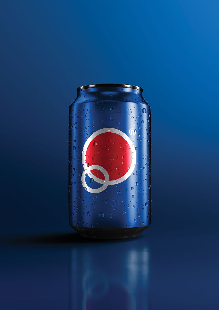
The Pepsi Brand Identity Re-Design challenges what it means to bring about a new look to an established brand while retaining the brand’s legacy and essence at the same time.
The new brand identity is based on the idea that ‘less is more’. By removing unnecessary design elements and reducing everything to a simple symbol, the new brand identity manages to achieve more with less. The new logomark is much simpler but also more flexible and diverse in meaning. For example, the logomark can represent the letter ‘P’ for Pepsi, bubbles from the carbonated drinks, a smile, a globe and more.
This project includes a detailed user interface design. The Pepsi Brand Identity Re-Design improves the visual style and user experience of the existing corporate website and mobile application, updating it to reflect modern design trends. Additional mobile-first features were introduced to improve the overall customer experience. These new features include an online ordering system which allows customers to purchase Pepsi products and fashionable merchandise featuring the new branding.
Red Dot Award: Design Concept | Concept | Visual Communication