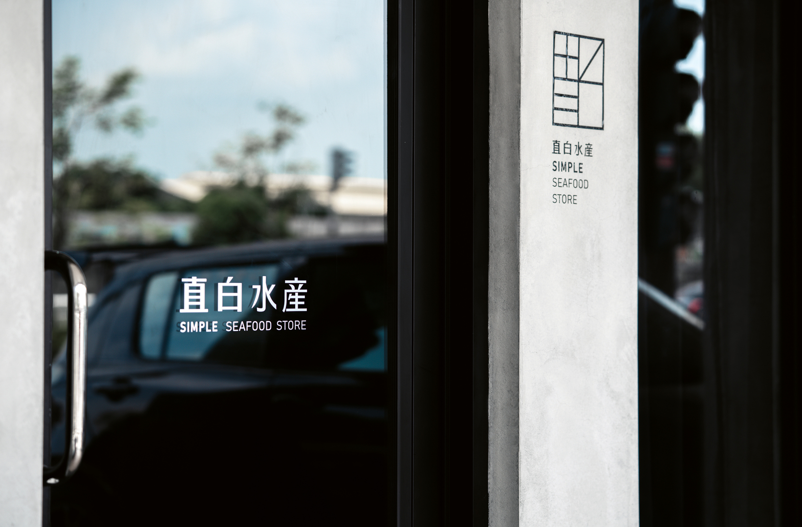
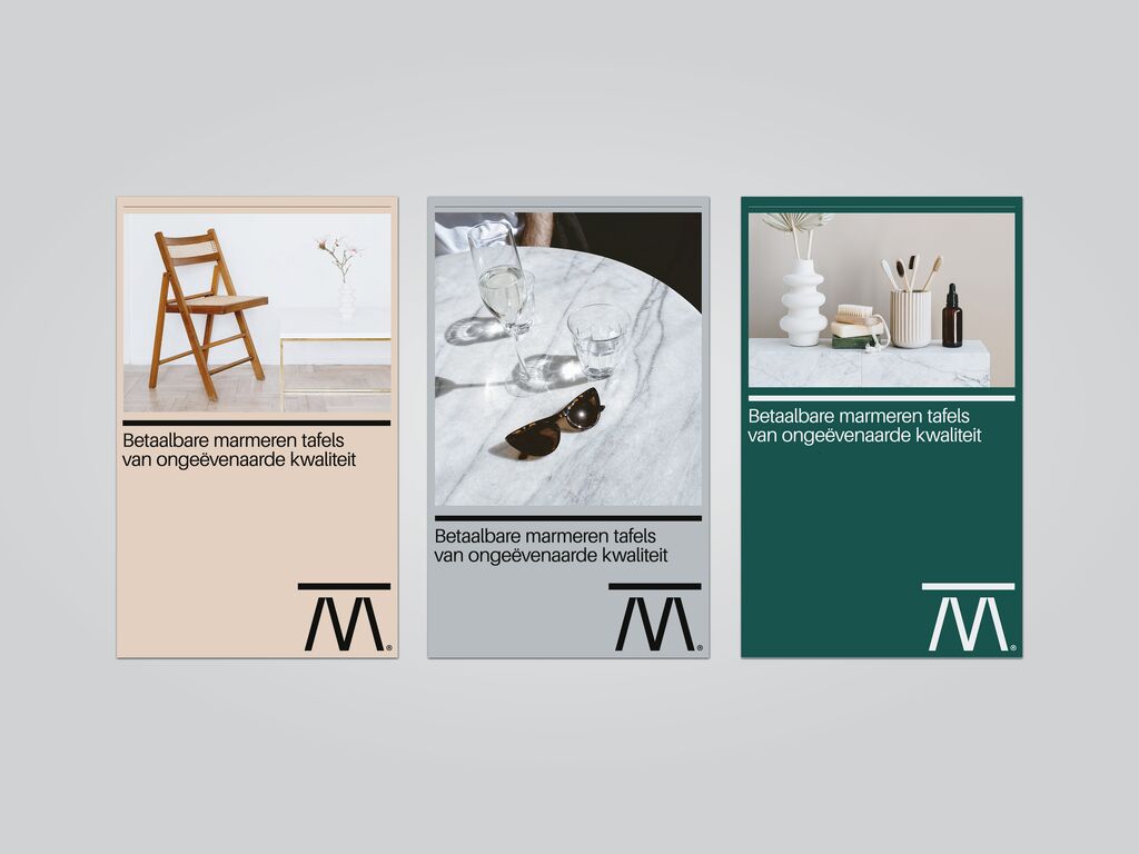
The main challenge behind the development of this corporate appearance was to provide consumers with clear information on the products offered, considering that food safety issues have become increasingly important in recent years. The straightforwardness of the brand is expressed through minimalist lettering and a black-and-white colour scheme. While the predominantly dark background highlights the colour of the seafood, the entwined details on the packaging provide an appealing contrast to the overall unobtrusive appearance.
Credits
University:
Shu-Te University, Kaohsiung City, Taiwan
Design:
Yun-Ping Chen
Chih-Hsuan Chien
Yun-Ni Jiang
Department of Visual Communication Design
Shu-Te University