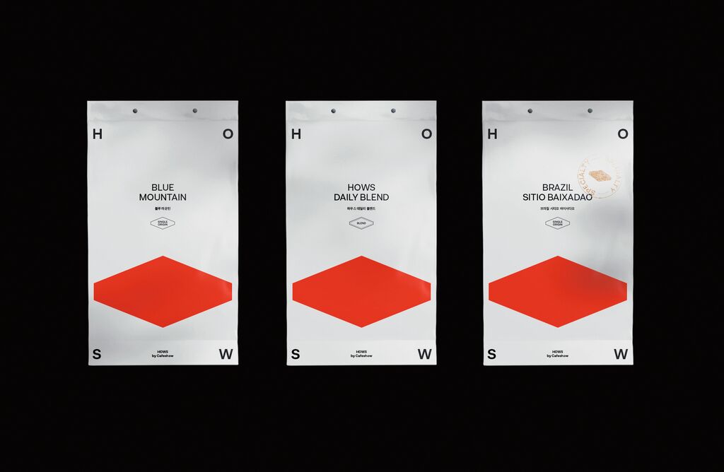
Brand Design

SKVOT

Back Download

SKVOT is a Ukrainian online school for creative people. The school aims at positioning itself as an “onoffline school”, a term that conveys the concept of combining online courses and self-organised learning. The logo features a graphic element derived from the squatter symbol. The arrow has been turned upside down to make the symbol appear like an “S”, referring to the first capital letter of the brand name. The typographical design of the lettering also captures the on / offline concept by combining the two fonts Helvetica and New Pixel Grotesk. In addition, the brand design is enhanced by different identification colours for the courses and stylish portraits of the lecturers.

Red Dot

By starting the video, you agree that data, e.g. your IP address, will be sent to Vimeo. vimeo.com/privacy

Others interested too