Brand Design

Slow Fish

Back Download

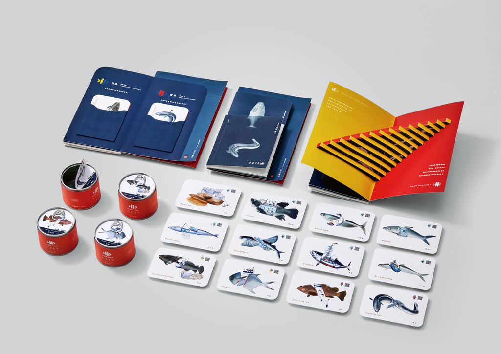
Fishing has been and continues to be an essential part of Taiwan’s economy. As fish stocks have declined massively over the past 30 years and only a quarter of the fish species in Taiwan’s coastal waters have remained, Slow Fish was launched as an initiative for sustainable fisheries management and moderate and responsible consumption. Following the Italian “Slow Fish” culture, which promotes ecologically sustainable fishing among other things, a virtual seafood brand was designed, consisting of different cans and sizes, combined with a seafood selection guide that provides a wealth of background information about fishery management and features a sophisticated logo symbol in three colours. The logo combines the universally known symbol of the pause, play and fast-forward buttons in the shape of a fish. Thus, the colour green and the symbol of the play button stand for “recommendable” fish that are still abundant, yellow together with the fast-forward button indicates “optional” fish, while red with the stop button stands for “better not to buy” because the stocks are severely threatened. In this way, the Slow Fish brand design provides visual education and raises awareness of this important ecological issue.

Statement by the Jury

Creating Full Awareness of the Problem in the Best Interactive Way: by Eating! The Slow Fish brand design does an excellent job of engaging consumers and raising awareness of the issue of endangered fish stocks. The visual concept of the logo, both in terms of colour and with the familiar buttons for “pause”, “play” and “fast-forward”, is excellently conceived and immediately comprehensible. The entire brand presence with beautiful cans made of recyclable aluminium, elaborately designed boxes and informative brochures has emerged as a consistently implemented, first-class strategy.
Red Dot: Junior Prize

Others interested too