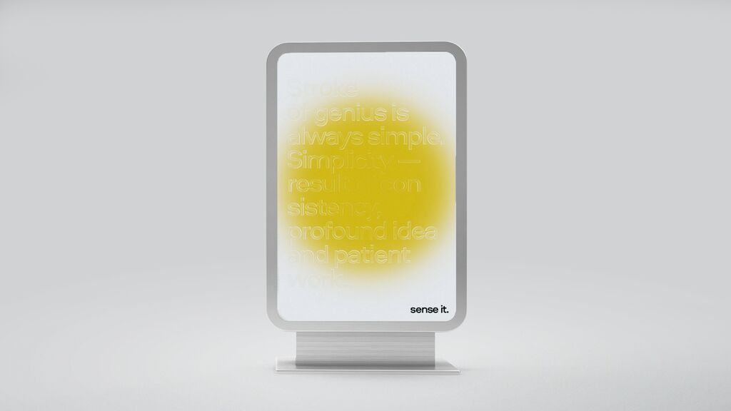
Logo Design,Brand Identity

We Never Drop the Ball

Back Download

The new corporate design of Japan’s top-level volleyball league, V.LEAGUE, was designed with the aim of attracting youthful players, energising audiences and raising its game around the world. To achieve this, an entirely new approach has been followed, one that sets it apart yet also uses Japanese cultural traits in an inspiring, novel way. The “V” in V.LEAGUE has become the heart of the concept. It has been redefined to evoke vividness, vision and victory, and at the same time hint at fearless passion and the traditional Japanese fighting spirit. The slogan encapsulates these notions into a rallying cry, reflecting the team spirit in a bold and confident new look. Thus inspired by the game itself, the design is derived from the precise teamwork, zigzagging movements and perfect actions of the players. The logo resembles a player diving with outstretched arms to intercept a ball. Its sharp, dynamic angles compel attention. In addition, the bold use of strong colours, framed on black and white, suggests fearlessness.

Statement by the Jury

The new corporate design for Japan’s top volleyball league convinces with a consistent use of the letter “V”. The design of this letter was inspired by a player’s typical dive after a ball, reflecting the dynamism and the fearless will – as the title clearly suggests – to never let the ball drop on the floor. A high level of recognition across all media is further enhanced by the use of a clear and reduced style.

Red Dot: Best of the Best

By starting the video, you agree that data, e.g. your IP address, will be sent to Vimeo. vimeo.com/privacy

Others interested too