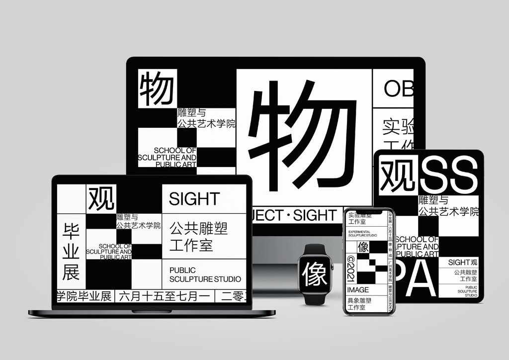
Brand Design Relaunch

WONJIN Plastic Surgery

Back Download

After 20 years in business, WONJIN Plastic Surgery commissioned a new brand mark and brand design. At the centre are the aesthetically curved initials “WJ”, which overlap and are reminiscent of ribbons, forming a brand mark that visualises the trusting relationship between customers and the clinic. In contrast to competitors whose visual language relies on reference photos, this brand design places an emphasis on elegant typography. Relying on the impact of an appealing key visual, the subtle visual language conveys notions of beauty and youthfulness.

Red Dot

Others interested too