

Interview with Bettina Schulz

In annual reports, duty and freestyle always meet – both parts are equally demanding for designers. Sometimes it is particularly successful to structure even the figures in an appealing way or even to present them in a surprising way and, on top of that, to shine with an exciting editorial part.
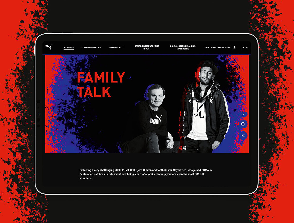
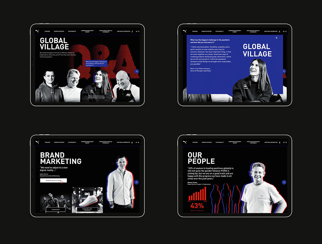
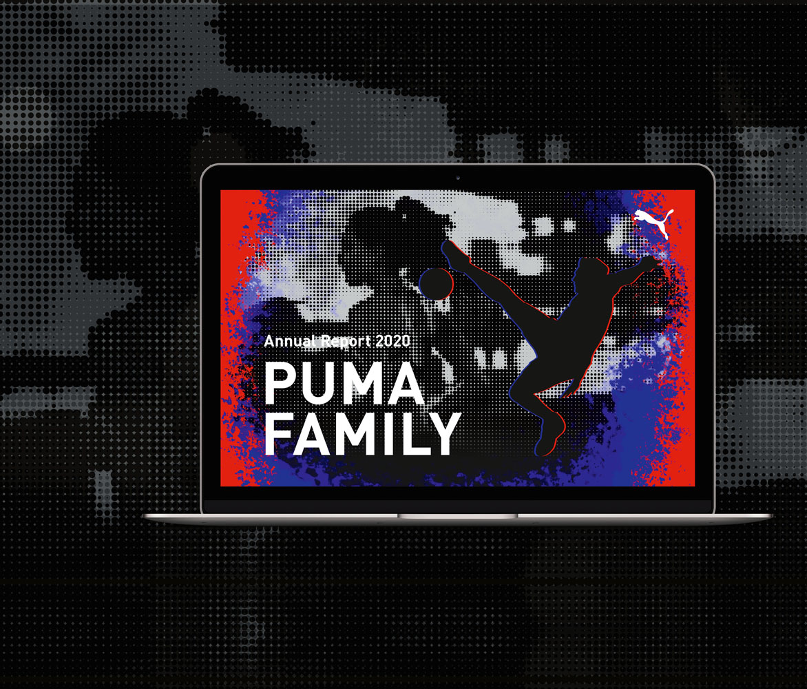
It may come as no surprise that many annual reports today are purely digital. Some would see this as a missed opportunity, because beyond the presentation of the business results, the reports always represent a valuable image instrument. Those who know how to play this can combine duty and freestyle in a marketing-effective way. This means the other way round: even the digital implementation of an annual report can only be convincing if it makes full use of its possibilities. With a dynamic brand like Puma, for example, a digital performance is absolutely consistent: speed and athleticism in moving images, a surprising image aesthetic as well as a clear user guidance already brought the supervising agency 3st kommunikation a Red Dot: Grand Prix in 2019, which is rare in this category. In the following year, the consistent continuation of this concept with new elements was rewarded with the Red Dot: Best of the Best award.

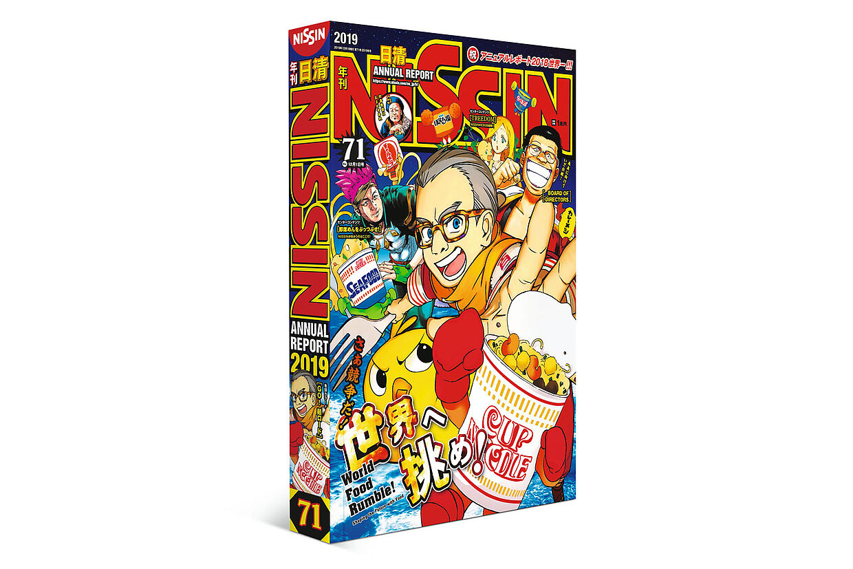
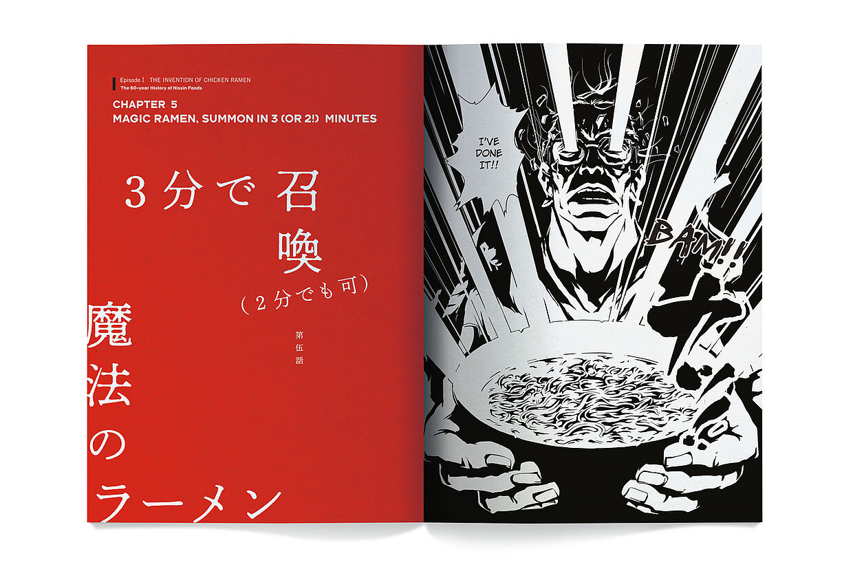
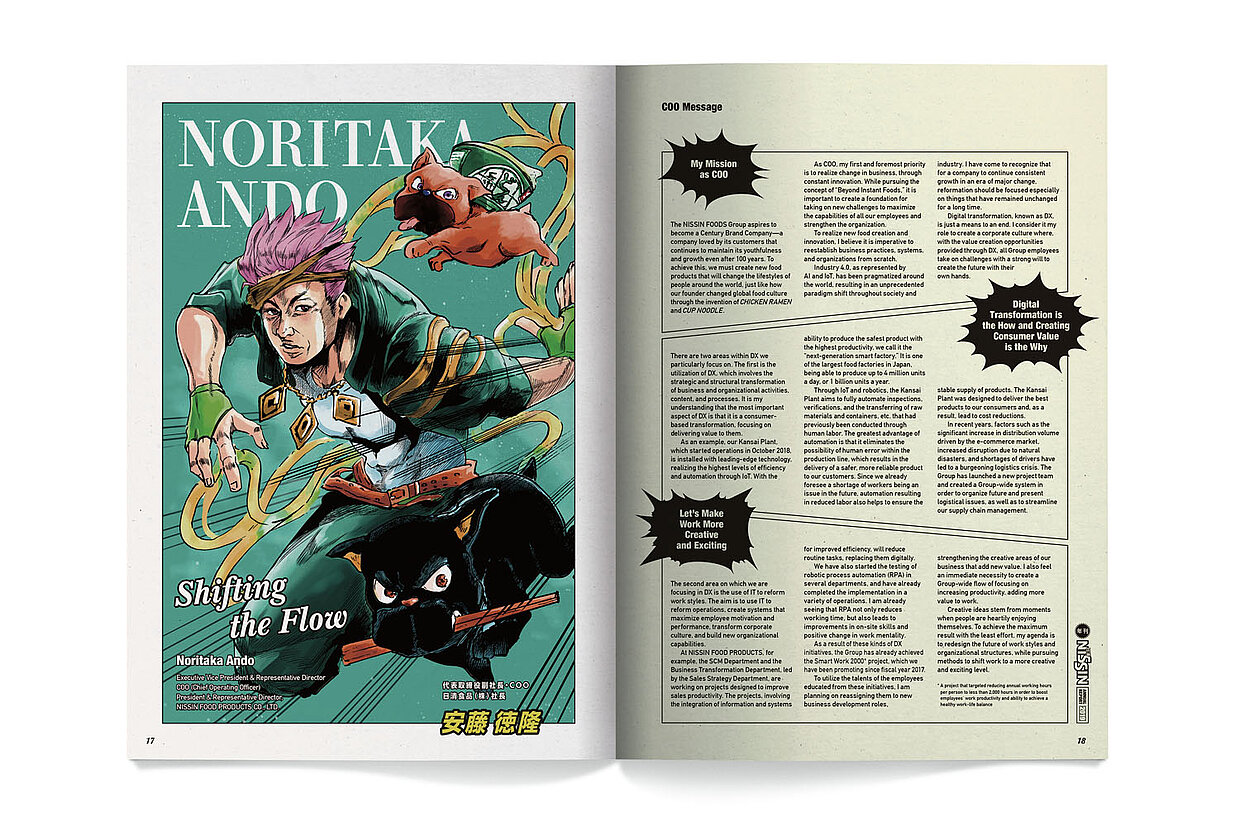
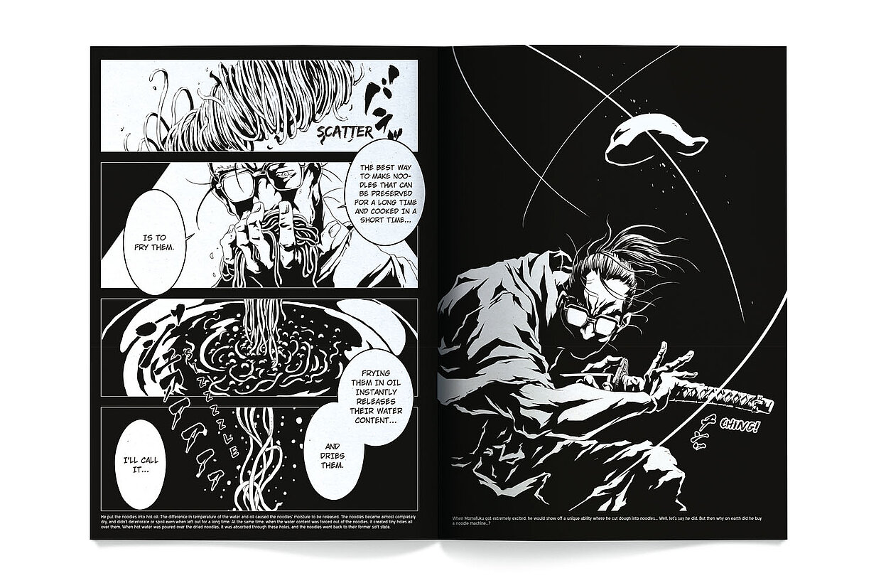
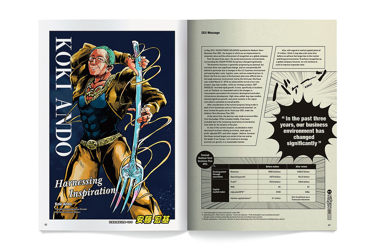
Those who continue to rely on the impact of print can certainly still cause surprises even among experienced Red Dot jurors. Nissin Foods succeeded in doing so in 2021 with its annual report, which was conceived and consistently realised as a manga comic. Even the company’s managers were presented in woodcut-like illustrations – the monochrome work with an appealing choice of paper received a Red Dot.
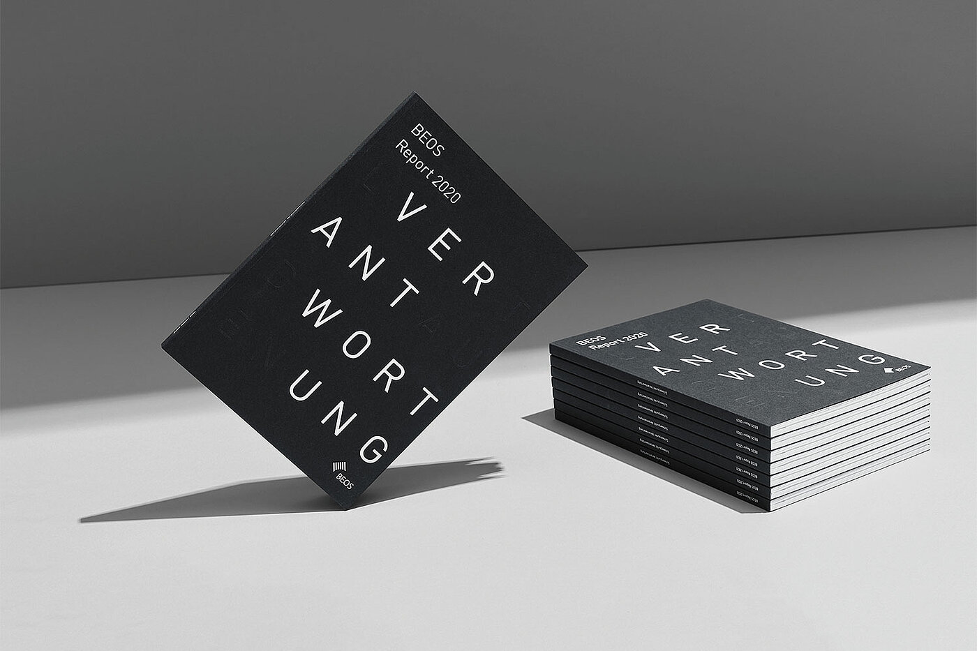
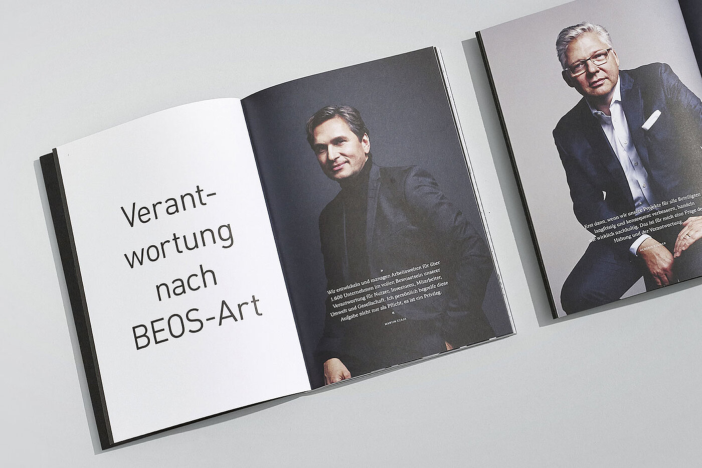
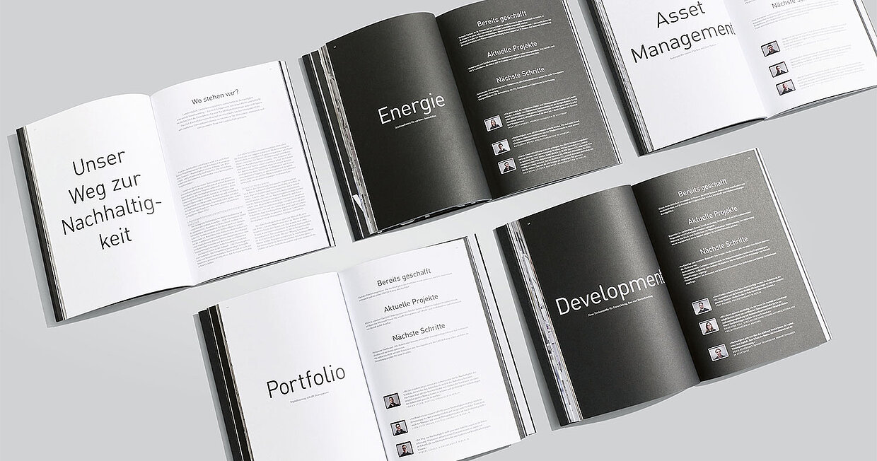
Even fine print details can convincingly present corporate values and break with some common visual habits and clichés. Last year, for example, the BEOS annual report, which focuses on the topic of sustainability, was convincing: In a pleasant way, not in the usual green garb, but monochrome in black and white with elegant blind embossing on the cover and excellent typography. The jurors rewarded this with a Red Dot in the annual report category.
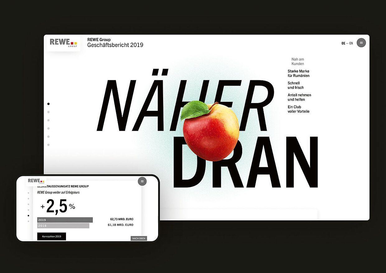
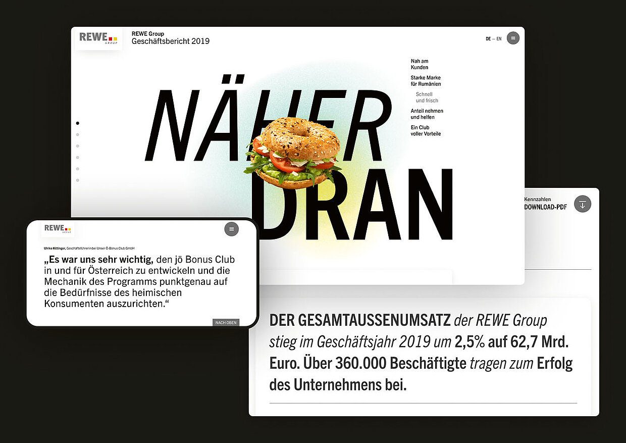
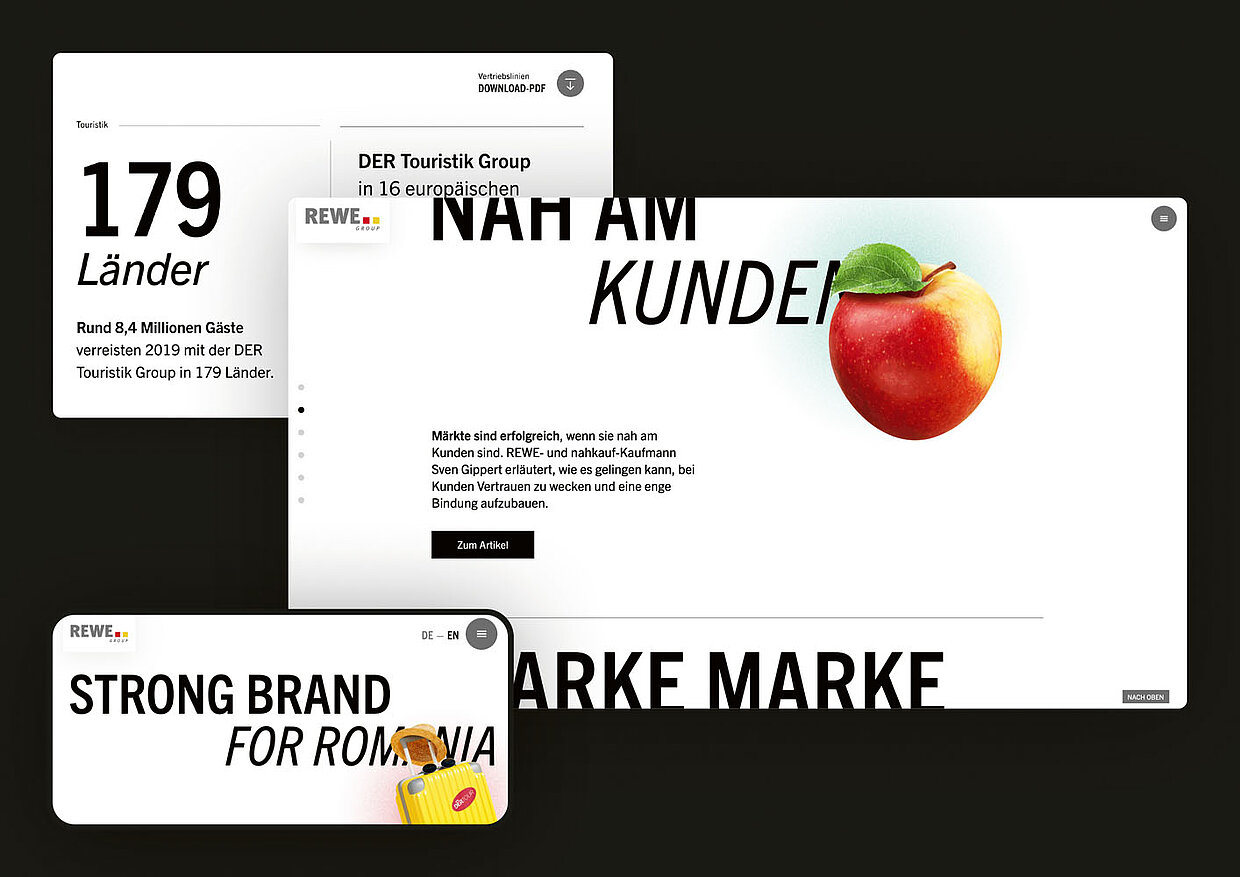
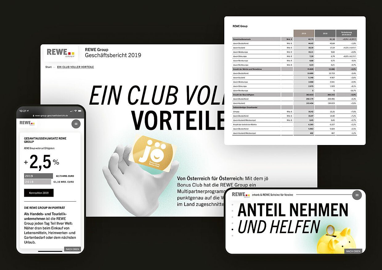
Anyone who deals in depth with the design of annual reports knows about the challenge of putting huge amounts of data into an aesthetic and easily comprehensible form. The evaluation of this performance is also one of the criteria for judging annual reports at the Red Dot Award: Brands & Communication Design. Thus, in the Corona year 2021, the approach of the REWE Group (KD1 Designagentur) “By your side – despite distance” was also convincing, working perfectly on all mobile devices with approachable animations and typographic sensitivity. The seamless integration of stories about the company through extraordinary images in the figures, appealing text and varied videos gets to the heart of the task of an annual report: in the best case, it transports tangible and intangible values in a sympathetic way.
You still have until 17 June 2022 to enter this year's competition for brands and communication design. By participating, you are applying for the coveted “Red Dot” distinction, which will be decided by an internationally renowned jury.

![[Translate to English:]](/fileadmin/_processed_/d/0/csm_Teaser_Print_1_3863dc4235.jpg "[Translate to English:]")