
canaria — Enjoy now and all your life.
Designer profile
or copy the link
canaria is a Tokyo-based agency that was founded in 2007 by designer and creative director Yuji Tokuda. Its range of services includes not only brand building and advertising, but also product development, e.g. for future space-travel concepts and novel technologies. canaria is adept at identifying problems, verbalising values to be shared with stakeholders and creating cheerful yet sophisticated designs that convey emotions.
Red Dot about canaria inc.
Thanks to our distinctive Japanese sensibility, we excel in both verbal and non-verbal communication.
canaria inc.
###DESCRIPTION###
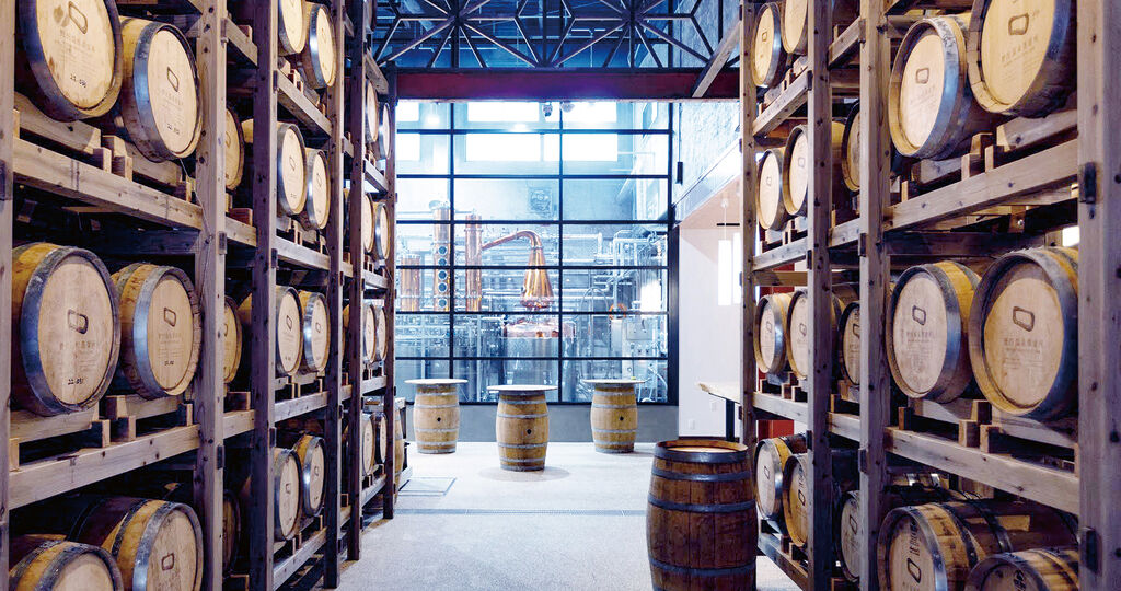
Die Nozawa Onsen Distillery wurde 2022 im gleichnamigen Skiort in der japanischen Präfektur Nagano gegründet. Das Dorf und die umliegende Gegend sind vor allem als malerisches Skigebiet bei Winterurlaubern beliebt. Wenig bekannt ist indes, dass Nozawa Onsen mit seiner abwechslungsreichen Landschaft und üppigen Natur auch in den anderen Jahreszeiten viel zu bieten hat. Mit dem Ziel, dem Ort durch hochwertige, handwerklich gefertigte Spirituosen zu mehr Bekanntheit zu verhelfen, gründeten einheimische Dorfbewohner gemeinsam mit ausländischen Zuwanderern die Nozawa Onsen Distillery, die in einer ehemaligen Konservenfabrik beheimatet ist und in der Gin und Whisky mit heimischem Quellwasser und lokalen Zutaten produziert werden. Mit der Entwicklung des Markendesigns der Destillerie wurde die Designagentur canaria betraut. „Die besondere Herausforderung bestand darin, dass für diese Destillerie ein Markendesign entstehen musste, das nicht nur von Leuten bewertet wird, die Spirituosen mögen; jeder im Dorf sollte sich mit der Brennerei identifizieren und sagen können, ‚Diese Brennerei gehört zu uns.‘“, so Yuji Tokuda, Kreativdirektor bei canaria. Dementsprechend steht die Herkunft der Getränke im Mittelpunkt des Markendesigns. Das gesamte Designkonzept basiert auf dem Thema „Blessings of the water’s circulation“ – eine Reminiszenz an die Besonderheit des Dorfes und der umliegenden Natur, die darin besteht, dass alles vom Wasser geprägt ist – Schnee, Schmelzwasser, heiße Quellen und vom Wasser seit über 50 Jahren hinweg geformten Landschaften bestimmen das Bild. Das riesige unsichtbare Wasserkreislaufsystem.Im Zentrum der visuellen Identität steht das Logo, das das Wasser, seine Bewegung und seinen Kreislauf symbolisiert. Es ist das Kondensat aus einer umfassenderen Illustration, in der außen um den Logokern herum mit viel Liebe zum Detail Dorfimpressionen, Flora und Fauna zu jeder Jahreszeit gezeigt werden. Auch die Typografie greift das Thema „Wasser“ in Form von Wassertropfen in verschiedenen Teilen der Schriftzeichen als Motiv auf, während ein dunkles Marineblau als primäre Markenfarbe für das Wasser an sich steht. Das Verpackungsdesign der Getränke, schlicht geformte Flaschen mit Holzdeckeln, stellt das Etikett in den Vordergrund, auf dem verschiedene Varianten der Illustration zu sehen sind – je nach Geschmacksrichtung unterscheidet sich zudem die Farbe als Verweis auf die Haupt-Pflanzenzutat – ein Designsystem, das Raum für den Ausbau des Angebots lässt. Das Logo findet sich auch in den Innenräumen der Destillerie wieder – auf Fußboden, Holzfässern, Beschilderung und Merchandising-Artikeln. „Das Key Visual ist detailliert ausgearbeitet und erzählt eine Geschichte, sodass es jeden, der mit der Marke in Kontakt kommt, auf einer emotionalen Ebene erreicht und auf diese Weise im Gedächtnis bleibt“, so die Jury in ihrer Begründung. Darüber hinaus sei der gesamte Markenauftritt sehr konsistent – von der Logogestaltung über Verpackungsdesign und Werbeartikel bis hin zur Corporate Architecture. So entstehe eine starke, übergreifende Markenidentität, die einprägsam sei und Raum für Identifikation biete, sodass die Nozawa Onsen Distillery über ihre Rolle als eine weitere Spirituosenmarke hinaus zu einem Symbol für die Wiederbelebung der Region werden könnte. In 2022, the Nozawa Onsen Distillery was founded in the ski resort of the same name in Japan’s Nagano prefecture. As a picturesque ski area, the village and surrounding countryside are especially popular among winter holidaymakers. What is less well known is that, with its varied landscape and bountiful nature, Nozawa Onsen also has plenty to offer at other times of year. With the aim of popularising the region through high-quality, artisanal spirits, local villagers worked together with foreign residents to found the Nozawa Onsen Distillery. It is housed in a former cannery and is used to produce gin and whisky made with regional spring water and local ingredients. The canaria design agency was entrusted with developing the distillery’s branding. “The particular challenge we faced was to create a brand design for this distillery that would be judged not only by people who enjoy drinking spirits; everyone in the village also had to feel they could identify with the distillery and be able to say, ‘This distillery belongs to us’,” canaria’s creative director Yuji Tokuda explained. Thus, the origin of the drinks lies at the core of the branding. The overall design concept is based on the theme of the “Blessings of the water’s circulation”, thereby evoking a particular feature of the village and the surrounding nature – namely the fact that everything is defined by water, with snow, meltwater, hot springs and landscapes carved by water over 50 years shaping the appearance of Nozawa Onsen. The huge invisible water circulation system. At the heart of the visual identity is the logo symbolising water, its movement and cycle. It is the distillation of a more comprehensive illustration, in which the central logo is surrounded by intricately detailed impressions of the village and the local flora and fauna in every season. The typography also references the theme of “water” as a motif in the form of water droplets in various parts of the characters, while the primary brand colour of dark marine blue symbolises water itself. Consisting of simply shaped bottles with wooden stoppers, the drinks’ packaging design foregrounds the label, featuring variations of the illustration. Depending on the flavour, the colour furthermore changes in reference to the main botanical ingredient – a design system that allows for expansion of the product range. The logo can also be found in the interior of the distillery: on floors, wooden barrels, signage and merchandise alike. “The key visual is intricately detailed and tells a story so that it evokes an emotional response in anyone who comes into contact with it, and this makes it memorable,” the jury reasoned in its statement. It also felt that the entire branding was very consistent, from the logo to the packaging design and promotional items, through to the corporate architecture. The result, the jury believed, is an overarching brand identity that is distinctive and allows people to identify with it, so that the Nozawa Onsen Distillery may be able to transcend its role as another spirit brand to become a symbol for the revitalisation of the region.

The Nozawa Onsen Distillery is located in a popular ski resort and produces craft gin using spring water from the region. In the design, special attention was paid to the connection between people (ski tracks in the snow) and nature, particularly the water cycle.
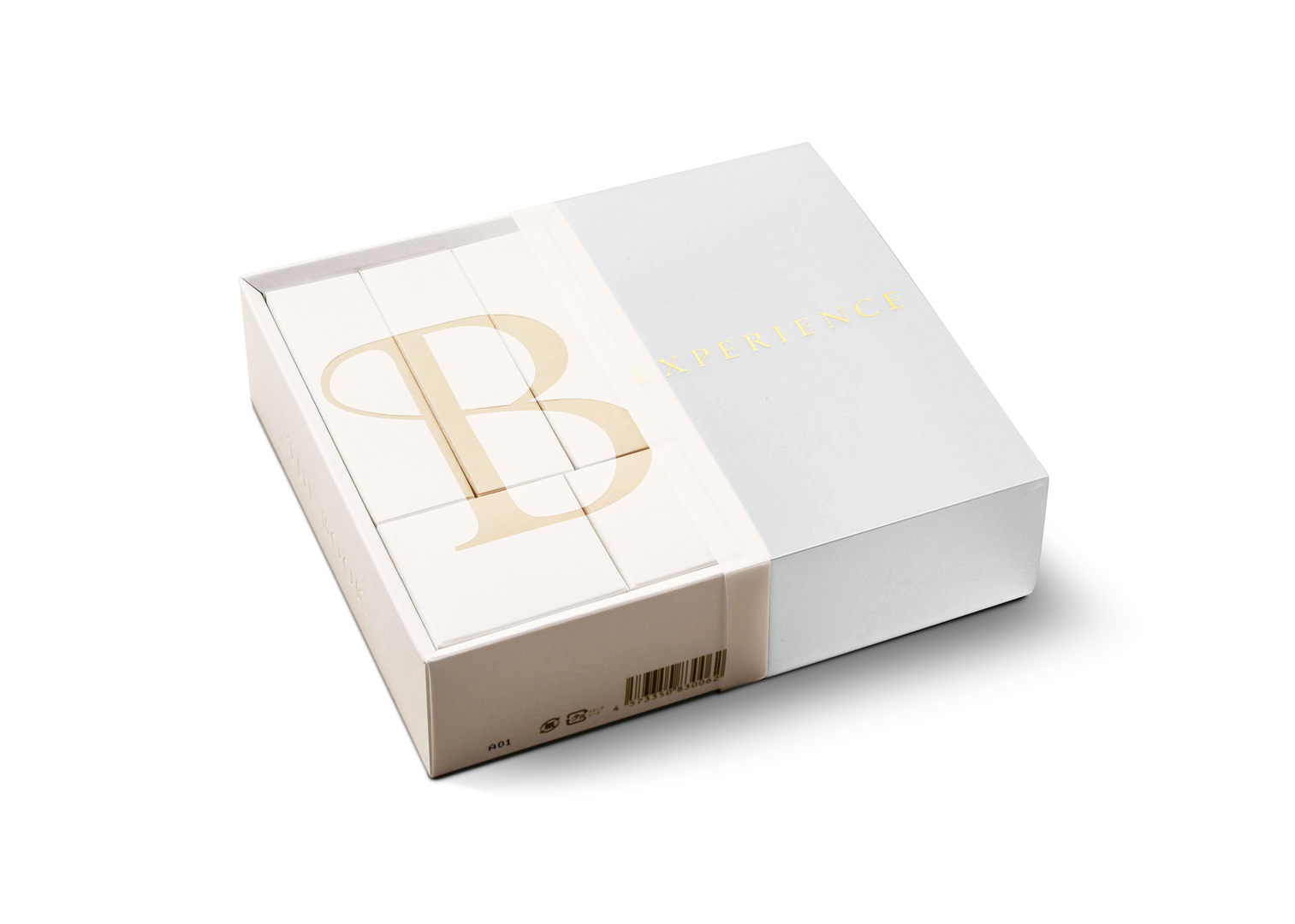
Die limitierte Sonderverpackung TWOOL 1st Anniversary präsentiert sowohl stilvoll als auch nachhaltig ein Kosmetikset zur Kaschierung von Schlupflidern. Aus reinem Papierzellstoff geformt und in zwei aufmerksamkeitsstarken Farben konzipiert, macht das Unternehmen zugleich auf das Jubiläum der Produkteinführung aufmerksam. „Die Farbwahl der Verpackung ist sehr untypisch für ein derartiges Produkt und erregt gerade damit Neugierde und Interesse“, befanden die Juroren. Eine elegante Blindprägung sorgt bei dieser Umsetzung zudem für ein haptisches Erlebnis, während die Produktinformationen mittig platziert sind und sich auch farblich gut sichtbar absetzen.

