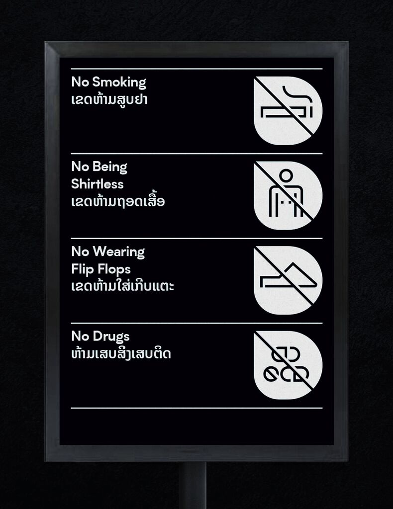
Brand Design

Toyooka Theater Festival 2020

Back Download

Toyooka Theater Festival 2020 was held in Toyooka City, Japan, overseen by a renowned playwright and director. The event aimed to promote the local theatre and revitalise the image of the small community of Toyooka. The brand design is characterised by six stacked red lines, each formed by abstract symbols. Each line symbolises the specific characteristics of one of the areas around the city. For example, wavy lines represent the sea and the abstracted rice grains refer to the agricultural land, while the blocks stand for Japan’s typical natural stone walls.

Red Dot

Others interested too