

![[Translate to English:]](/fileadmin/_processed_/f/3/csm_DP_InFormat_Design_92-DP01238-2021BC-2_a6903fbb21.jpg "[Translate to English:]")
InFormat Design Curating — Curating is the way that we make design happen.

Few brands in Germany play out their image as consistently in all facets as Deutsche Telekom. Its registered “Telekom magenta” plays just as important a role as its unmistakable sound branding.
1 January 1995: a special date for Deutsche Bundespost Telekom. On this day, the public-law company becomes the private-law public limited company “Deutsche Telekom”. From now on it has to face competition. At the beginning of the nineties, competition was fierce: mobile communication was gaining momentum and with it the number of competitors. To hold one’s own here required not only a good business strategy. A striking image was needed to shake off the dust of bygone days. With the unmistakable “Telekom magenta”, the company is making a strong statement.

The harmonious interplay of all components, manifested in the brand claim “Life is for sharing”, a life-affirming visual language, sound branding, typography, colour and the instruments developed from it, has over the years created a positive corporate image that works worldwide. Always fine-tuned and yet unmistakable – this consistent brand management was recognised by the Red Dot jury in 2019 with the award “Red Dot: Brand of the Year”.
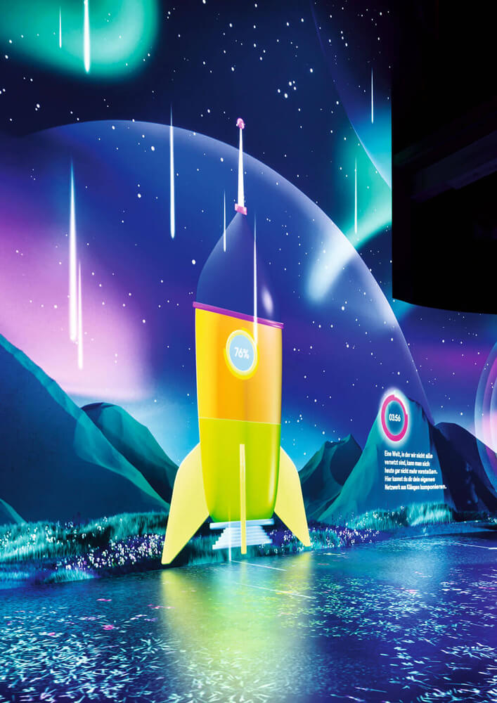
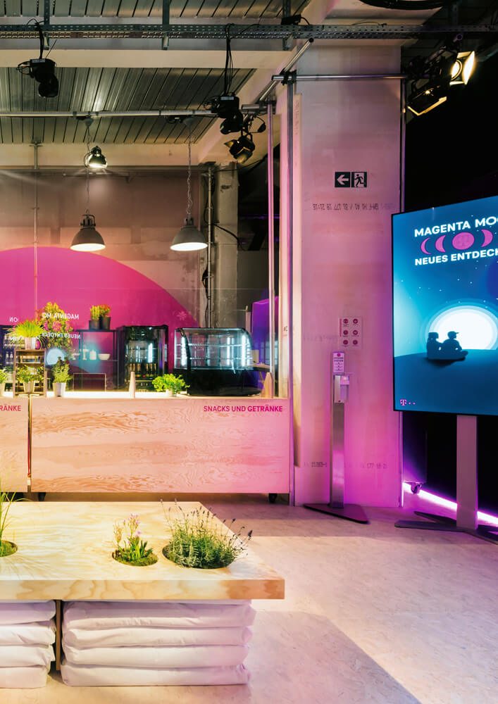
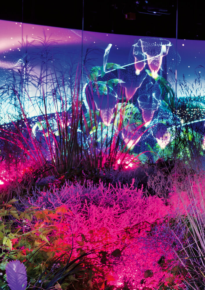
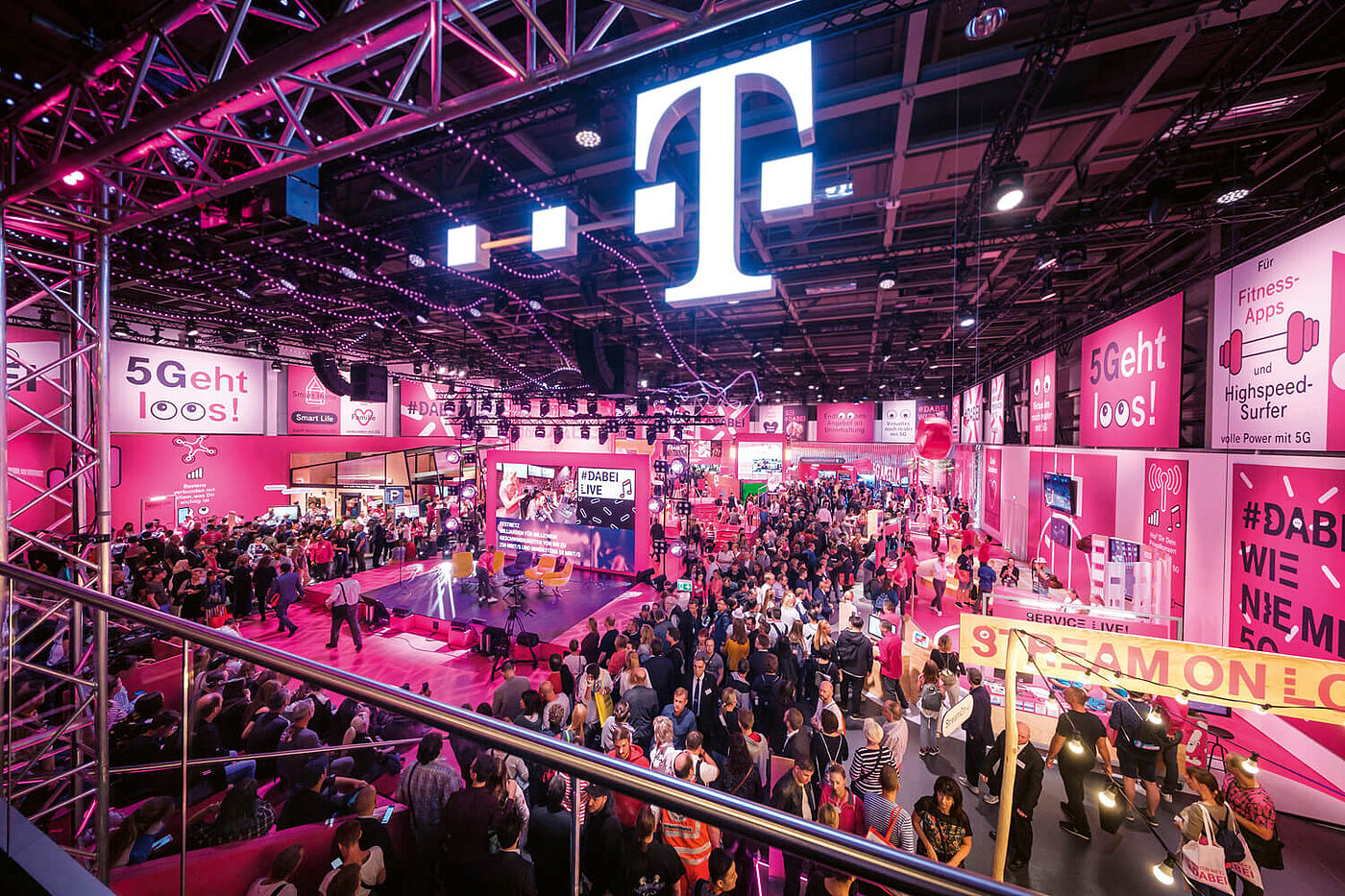
Telekom is taking account of a further development in the customer experience with the opening of its Brand Experience Flagship Store Stuttgart and the Magenta Moon Campus education centre: Telekom is thus succeeding just as impressively in making its own brand tangible and thus also making the now digital world tangible in analogue form as it is in sustainably consolidating its position as the world’s leading telecommunications company. Both worlds of experience are finally crowned in the Red Dot Award: Brands & Communication Design.
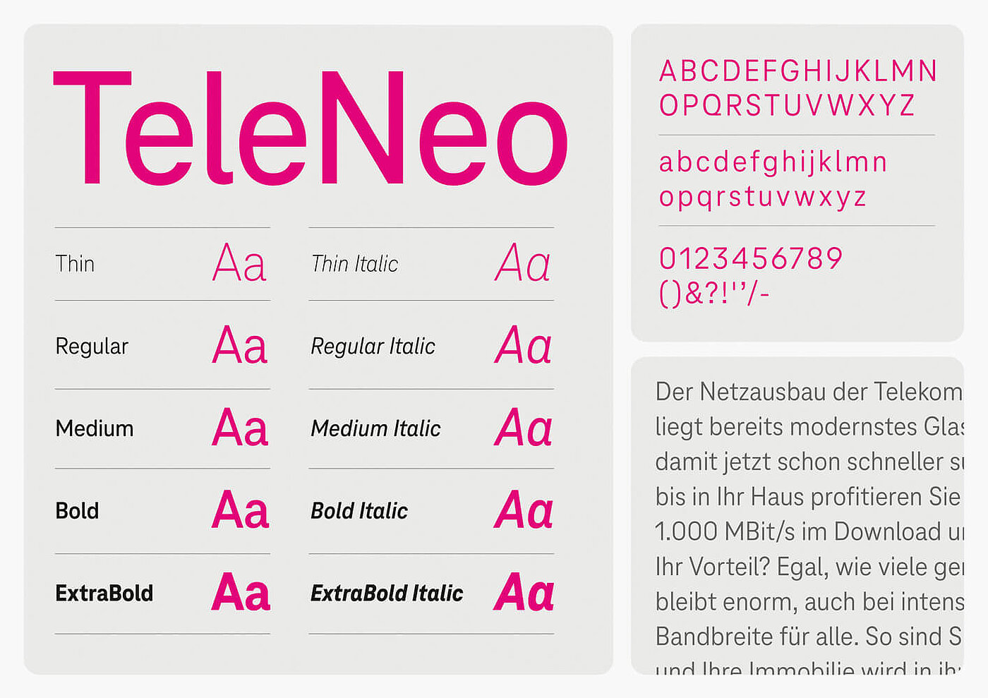
Although the white font on magenta ensures a high recognition value right from the start, the font also has to be adapted to the zeitgeist and for digital applications. Telekom TeleNero is a smooth transition into the typographic modern age – sans serif and reduced, it fits seamlessly into the existing corporate design. With its tailor-made character, it works in both digital and analogue media. The sensitive design was also awarded a Red Dot in 2021.
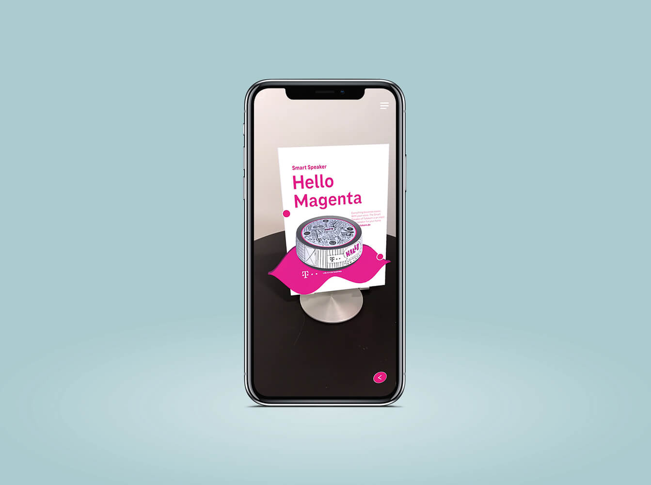
From what was once purely a service, Deutsche Telekom has developed other business areas over the years. These always remain very close to the brand: “Love Magenta” is the credo of the fashion and accessories collection, which emotionally connects technology with its users. The company’s technical expertise is in turn reflected in the constant development of sophisticated telecommunications tools; for example, the Speedport Smart 4 Plus won a coveted award in the Red Dot Award: Product Design, as did the Liquid Design AR App in the Red Dot Award: Brands & Communication Design in 2021.
Sound meets colour meets writing – over the years, Telekom has managed to offer a multi-sensory brand experience that continuously adapts to technological developments and thus appeals to all age groups. This is how the former state-owned company became a modern, international brand that successfully translates its values into a universal, emotionally charged language.
Brands still have the opportunity to apply for the “Red Dot: Brand of the Year” award until 17 June. Submit your brand profile and have the quality of your brand confirmed by renowned experts. Then use the internationally renowned Red Dot Label and communicate your competition success visibly on all platforms. You can find all information about the Red Dot Award: Brands & Communication Design on our website.
![[Translate to English:]](/fileadmin/_processed_/b/7/csm_92-DP06222-2021BC-7web_7c341f441a.jpg "[Translate to English:]")