JUMBO EV GEREÇLERI SAN.TIC. A.S.

Red Dot: Although the Pulse is fully electric, it retains the shape of a classic fuel tank. To what extent are such references to combustion models still relevant today?
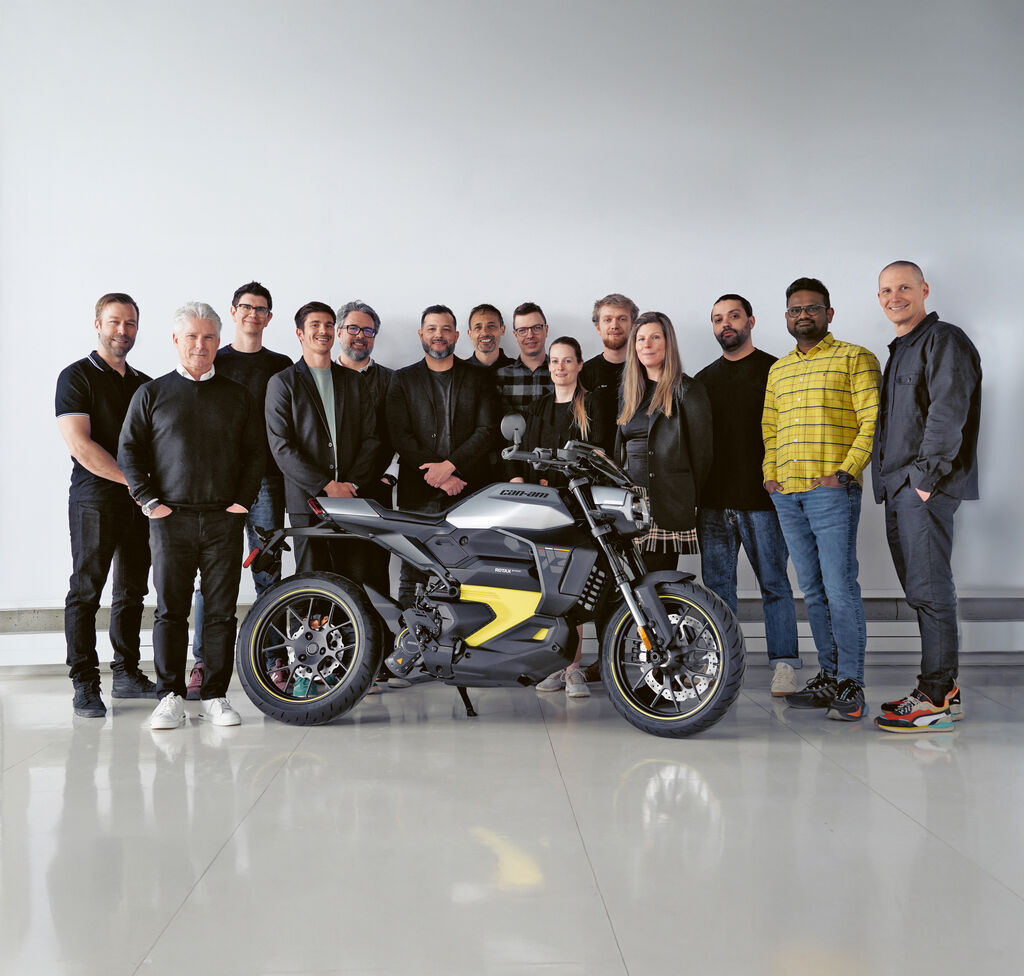
While the fuel tank is no longer functionally necessary, it remains an ergonomic and symbolic anchor. Riders can instinctively relate to that shape. For the Pulse, we have deliberately retained the geometry to create a link to Can-Am’s heritage and brand identity. The shape is more than a nod to the past – it facilitates the entry into electric mobility.
Pulse is aimed at an urban target group. What design strategies have you used to convey accessibility and user-friendliness?
Accessibility is deeply embedded in our design philosophy. This means eliminating complexity and irritants: no gears, intuitive usability and a lightweight, compact form for effortless handling. Our ergonomic approach appeals to a wider audience and democratises mobility on two wheels – friendly, welcoming and exciting without compromising on the thrill.
Can-Am stands for user-friendliness, performance and off-road fun. What makes the Pulse a genuine Can-Am vehicle despite its urban focus?
The Pulse carries the soul and robustness of Can-Am. Even in the city, it’s not just about A-to-B mobility. The geometry and dynamics offer snap, agility and those moments of unexpected joy – the smile when the ride becomes an experience. The construction epitomises our roots: rugged, reliable and engineered to take a challenge. The DNA of durability and performance is preserved – ensuring that even in an urban setting, it still feels like a true Can-Am: rebellious, engaging and powerful.
