Interview with Benjamin Hubert
Layer
Red Dot: SEKKISEI BLUE is an aesthetically composed packaging solution that incorporates traditional elements. What was your inspiration?
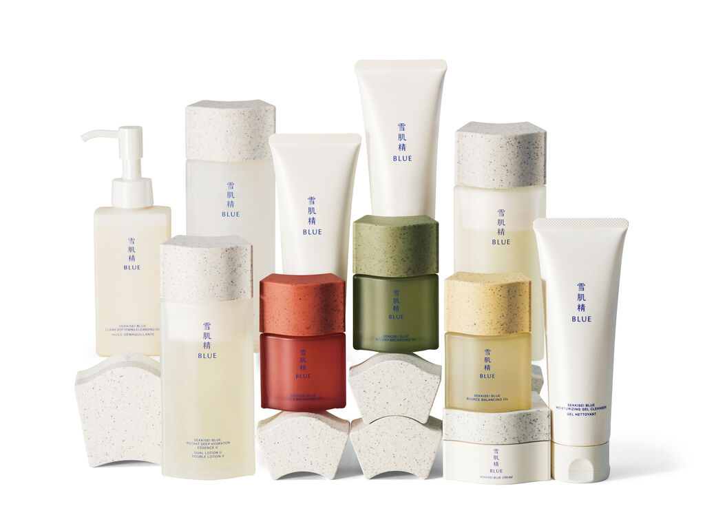
Japanese brands that write their names in Chinese kanji characters tend to present themselves in an overly traditional way. Sometimes this results in them having an old-fashioned and ostentatious style that is difficult to integrate into everyday life. It’s a bit like putting a throne in your living room. We tried to steer away from that by creating SEKKISEI BLUE as a traditional product manufactured in a modern way. It’s like a chair: it has the same function as a throne but is more minimalist.
Can you explain the idea behind the design in more detail?
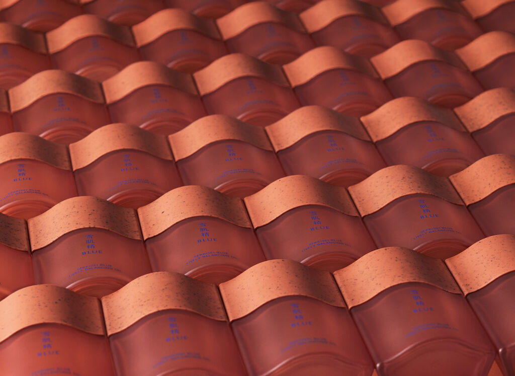
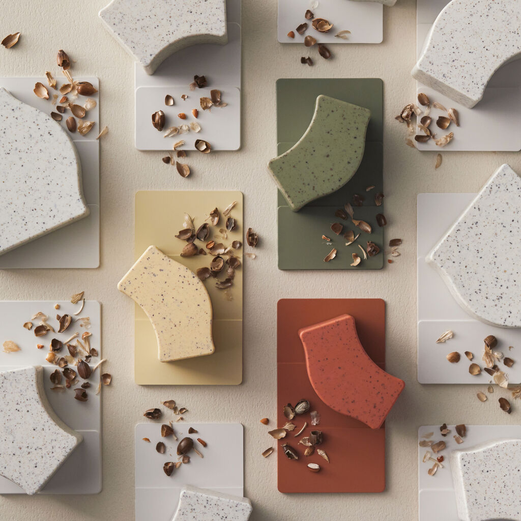
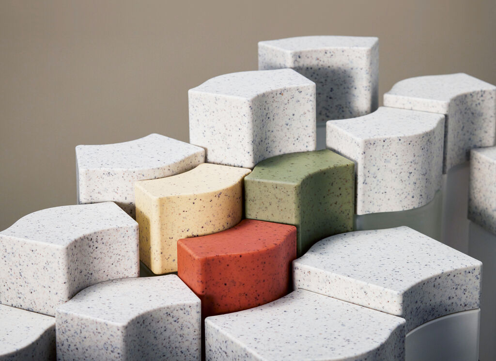
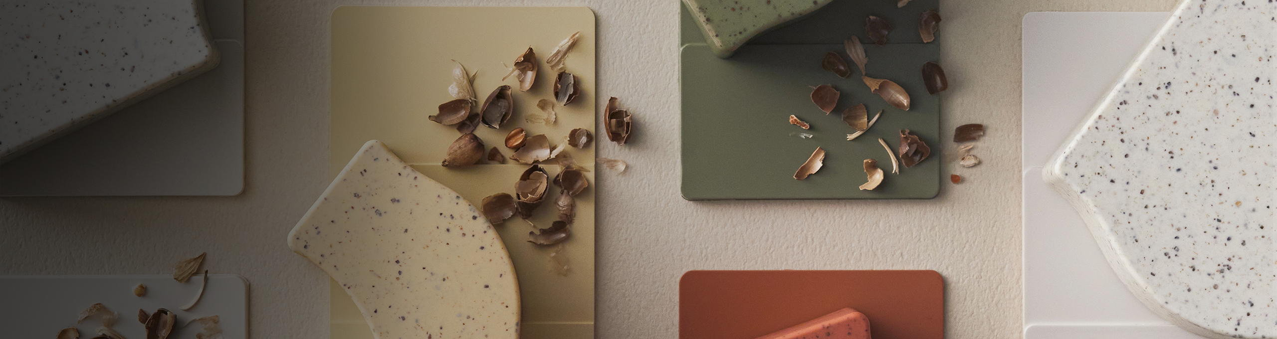
This cosmetic product is based on the concept of traditional Kampō herbal medicine, which focuses on achieving balance and harmony within the body so that it can heal. We wanted to express this balance in the design. Traditional Japanese roof tiles were actually the inspiration for the packaging. Their simple yet functional form creates an understated look.
Adlay husks were used for the closures …
Yes, adlay husks are a waste material in the production process. Sustainability is firmly embedded in the brand philosophy – and all aspects of sustainability bear direct relation to the product. It is a means to an end.
How do you create a visual perception of content, especially in the cosmetics sector?
It’s important to focus on the overall effect of the ingredients rather than on individual product components. Cosmetics perform a specific function. People use them because they want to look beautiful or enhance the appearance of their skin. In other words: we focus on a visualisation of insights.