
Winners profiles 2025
With an eye-catching new corporate identity, Verifone aims to both communicate its digital transformation and strengthen its customers’ trust in its payment services. NORD ID, one of Scandinavia’s leading strategy and design agencies, has realised these goals in a highly sophisticated way and with a touch of playful lightness. The expressive client font, flowing graphic elements and charming animations create an unmistakable identity that remains true to the agency’s credo: Growth by Design.
Red Dot: What specifications did the client Verifone mention when approaching you to design its new corporate identity?
NORD ID: The world of commerce has evolved tremendously over the past decade and continues to do so – particularly when it comes to payment transactions. Through innovation, acquisitions and integration, Verifone had achieved a significant strategic, commercial shift in its offering – moving beyond its heritage in physical payment devices. However, this shift was not reflected in the company’s positioning or identity, nor was it present in the minds of its customers. Verifone wanted the new brand to match their digital-first thinking, employee-focused mindset, and accelerated innovation.
What values were at the forefront?
Having traditionally worked with physical devices, Verifone is now fully focused on digitally empowered omnichannel payment solutions, so the identity needed to become more dynamic and forward-thinking – it is meant to be both curious and knowledgeable. We achieved this by incorporating digital and moving elements that are simply fun – thus making Verifone more accessible.
Did you pay particular attention to the animations?
We put a lot of effort into the animations. The core of Verifone’s moving image language is to create a sense of controlled fluidity – similar to a seamless buyer’s journey, where data and transactions are passed through secure and established systems. This also means that the start and end of the animations are perfectly timed, further strengthening the perception of control.
The bold typography is also striking. What role does this play in the appearance?
The custom typeface plays a big role in Verifone’s CI. We designed it to feel both stable and timeless – stable because Verifone handles payments, and timeless because sustainable and lasting design is what we believe in. Connected with the flowing dots, the typeface is visually subtle and designed to be clear and legible in all applications.
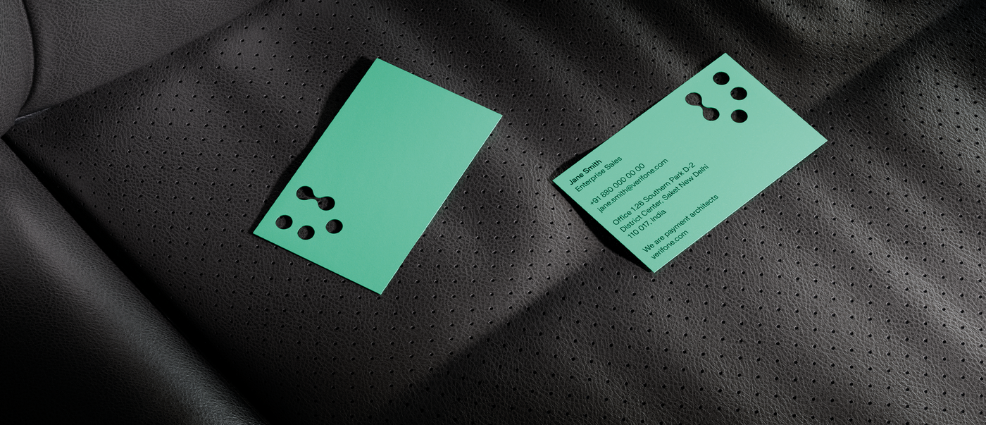
You opted for die cutting for the business cards. Can print media still anchor a brand more firmly?
In recent decades, more and more aspects of our lives have become digital. However, we are convinced that analogue media continue to play an important role in branding. This means that we need to design the few analogue applications even more carefully, making sure they work more effectively than ever before.