![[Translate to English:]](/fileadmin/_processed_/f/a/csm_02-05761-2023BC.0995918_CO_34bca5a0c6.jpg "[Translate to English:]")
Serviceplan
Winners profile
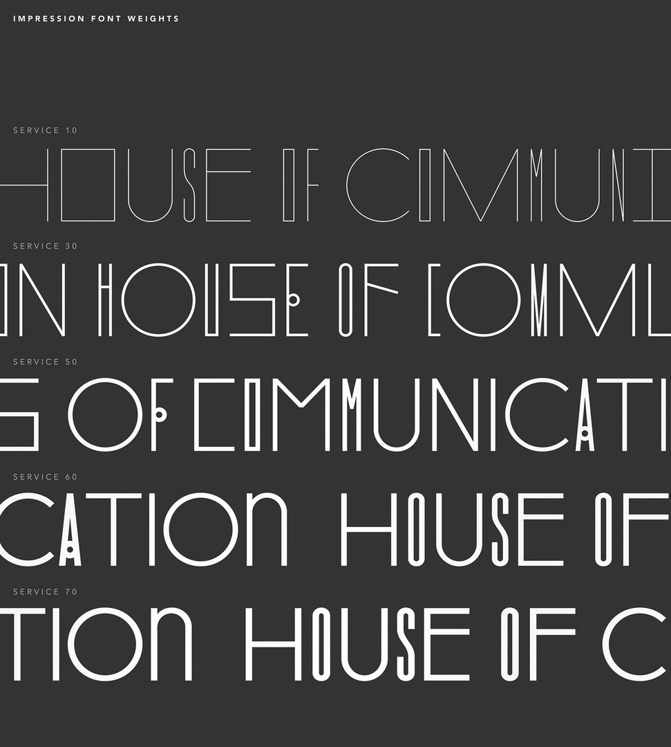
With the move to The New House of Communication, Serviceplan developed a typographic orientation system in collaboration with Andreas Uebele and his team. The resulting font “Service” – in its playful lightness – reflects agility, flexibility and interdisciplinarity, both in architectural spaces and as a decorative font in digital and analogue media. The resulting typeface is also woven into the monumental light carpet of the House of Communication.
Red Dot: The font was created while developing an orientation system for The New House of Communication. Was the main focus entirely on its spatial effect?
büro uebele | SERVICEPLAN: AUE: The luminous font carpet is not an end in itself, but an expression of the important, overarching goals of the orientation system. And, of course, the pictograms and all the other elements – signs, arrows and symbols that relate to the interior design grid – are also conceived to match the font. This luminous, visual and functional backbone is accompanied by a subsystem that presents itself to staff and visitors on walls and pillars, at those points where paths cross and correct decisions have to be made. Just like in a creative process: right turn, left turn, straight ahead or back again?
MH: A font in a space is never just a vehicle for information. Our font Service shapes the perception of architecture, takes up its structure and playfully develops it further.
The font does not have classic typefaces but is flexible in height and width. What are the advantages and disadvantages of this?
AUE: The font was developed for orientation system requirements which are very diverse and not standardised. For example, the many glass partitions of different lengths leading to the conference rooms could be individually designed by placing the word “conference” and an index number on the respective partition – each time different and self-sufficient, but always filling the entire area. The downside: we had to find corresponding line thicknesses for each majuscule height so that the overall look would be uniform.
MH: We have a wonderfully flexible font that can be adapted to any scenario in the house. From narrow concrete pillars to such wide glass partitions – always pragmatic, always full of character.
The font is also used on the website. Was a visual break with the house font a compromise here or most definitely intended?
MH: The fact that the font is also used on the website was not initially planned. But what can you do when it is so well received? But in all seriousness, the font is a wonderful addition to our house font for particularly visible and distinct purposes such as large headlines – the proverbial cherry on the cake, so to speak.
Which three adjectives would you use to describe the typography?
AUE: unique, universal, uebele
MH: distinctive, unique, lively
![[Translate to English:]](/fileadmin/_processed_/9/2/csm_03-05984-2023BC.0991559_CO_a363e7eb1e.jpg "[Translate to English:]")