
![[Translate to English:]](/fileadmin/_processed_/f/a/csm_02-05761-2023BC.0995918_CO_34bca5a0c6.jpg "[Translate to English:]")
Serviceplan
Winners profile
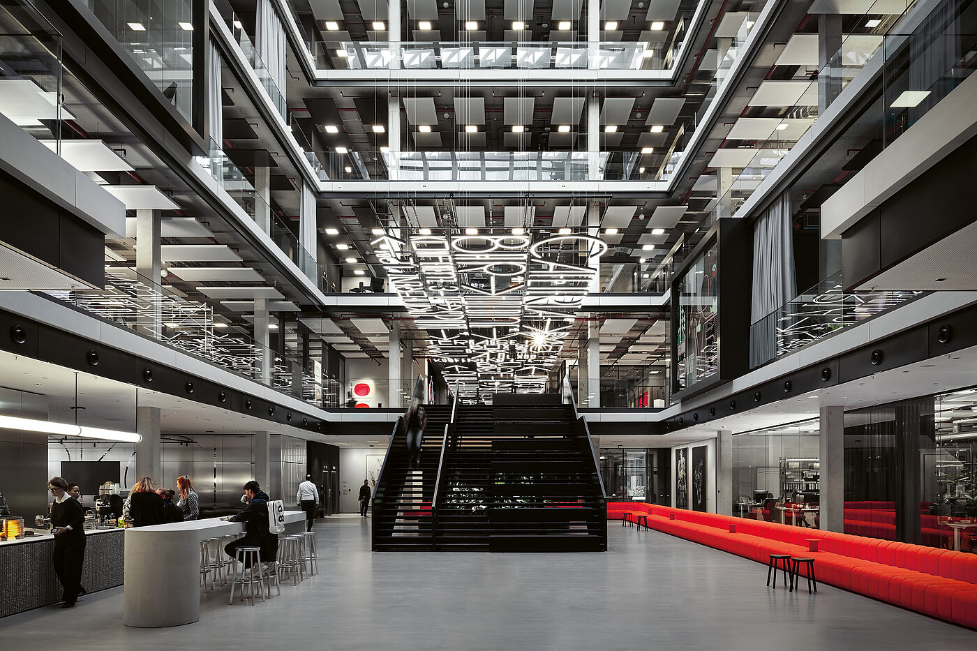
Serviceplan moved into a new 25,000 sqm creative quarter in Munich – where all design disciplines work together in an open atmosphere. To make this philosophy spatially tangible, the team from Büro Uebele worked with Serviceplan to develop a typographic orientation and branding system. Thus, a 130 by 6 metre illuminated ceiling panel of words and icons connects three buildings to celebrate communication.
Red Dot: Is it difficult to be your own client and also to work with such a strong designer personality as Andreas Uebele?
MH: Haha. I love strong designer personalities, especially when they are as nice as Andreas. Strong personalities have strong opinions and strong ideas. This includes empathy, that is, being able to immerse yourself in a job, as well as the ability to depart from the beaten track of the expected.
Could you say that information becomes a statement with the resulting carpet of light?
AUE: When one of the largest owner-managed advertising agencies in Europe moves into a new building, the orientation system has to be as creative as possible. So there is not only a specially designed font, but also a flying, luminous carpet woven from this very type. The light installation sends a clear signal: Watch out! Creative minds work here, special things are made here, this is the headquarters and the stronghold of advertising.
MH: In any case, the light carpet is more than just an orientation system. It is a work of art that celebrates language. And it is an Instagrammable icon that appears in practically every photo that employees and guests take with us.
The icons and characters are based on the existing brand architecture, but are themselves very expressive ...
MH: Expressive is a nice word, but too indirect for me here. In fact, despite all the enthusiasm, there were also a few voices questioning whether the characters are quickly legible. My answer is that this font is not a PPT system font like an Arial, but an architectural decorative font that you should be able to look at for years. In addition, the Serviceplan brand carries a strong service and goal orientation, as the name suggests. With this font, it has gained something poetic that has already played a part in its best work for some time.
What should the orientation system convey to visitors?
AUE: The seven living rooms across all three buildings are marked with large, brightly coloured terms by the philosopher Hannes Böhringer. In different languages and writing systems you can read the words “to bring” (English), “to find” (Russian), “to err” (Chinese), “to make” (Italian), “to put” (Dutch), “to guess” (French), “to take” (Spanish) and “to call” (Arabic). This linguistic diversity communicates the plurality, internationality and diversity of the company, supported by the many variants of the font and its characters.
![[Translate to English:]](/fileadmin/_processed_/6/d/csm_07-05764-2023BC.0995921_CO_2e7c427aab.jpg "[Translate to English:]")
![[Translate to English:]](/fileadmin/_processed_/b/5/csm_18-06257-2023BC.0997178_CO_2e38da9da5.jpg "[Translate to English:]")