
Interview with InPost | TADADAM
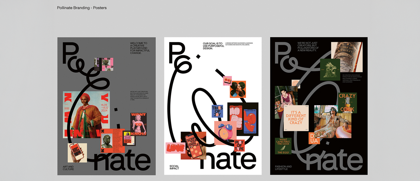
To design its own corporate identity, Pollinate had to delve into an exploration of its values and goals. The logo traces the pathway of the bee to symbolise the agency’s way of working, which is highly focused yet always in motion. It’s a strong concept reflected in an energetic, optimistic and somewhat rebellious design.
Red Dot: Was it difficult to design for your own studio?
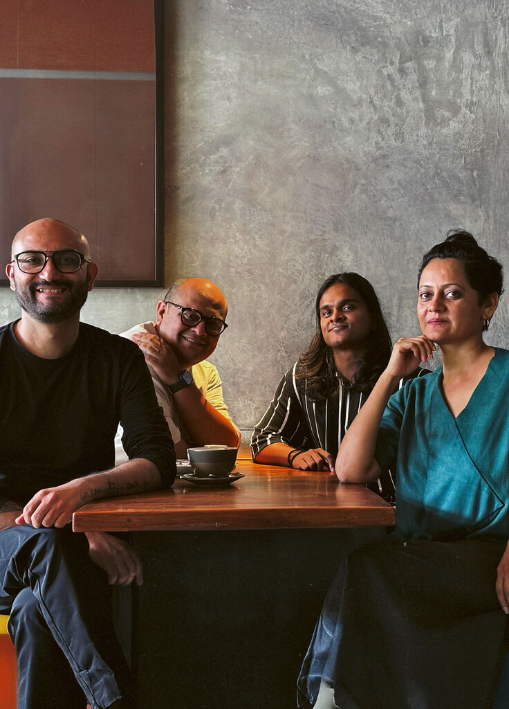
Designing for oneself is an act of soul-baring – a dialogue with your own ideals. You have to hold up a mirror to yourself, not to trends or client expectations, but to what you stand for. We had to capture our spirit in Pollinate. Every element was scrutinised and, as a client, we were opinionated, exacting and unwilling to compromise. The end result is an identity that reflects this intensive journey.
Why did you opt for a dynamic logo?
We see a logo not as a fixed mark, but as a living part of the brand’s story. Pollinate was never meant to be static. It’s an ecosystem that is constantly in dialogue with the world around it. The logo became a framework that could shift, adapt and respond, while always retaining its core spirit.
You use your logo very prominently, almost like an illustration …
An identity should be the backbone of any living brand, not just a mark that sits in the corner. It is a presence that shapes how the brand moves in the world. We wanted to create a form that is fluid, but would be effective across all media, scales and applications. In fact, we treat the logo almost like an illustration – a storyteller in its own right that becomes an active participant in every conversation the brand has.
What’s Olli all about?
The bee was our muse right from the very beginning. We were fascinated by its pathways: fluid yet purposeful, instinctive and yet precise. When we were creating Pollinate, we kept coming back to the same image, the dot on the “i” waiting to take flight. From that we developed a curved, flowing form that became a symbol of our way of working. Today, Olli is our creative anchor. We have Olliday gatherings and there’s an Ollipop pop-up. It has evolved from being a design element to being the heartbeat of Pollinate.
What was the toughest challenge?
Knowing when to stop – although the freedom to push, play and surprise ourselves again and again made the whole ride a real joy.

