Stjepko Rošin

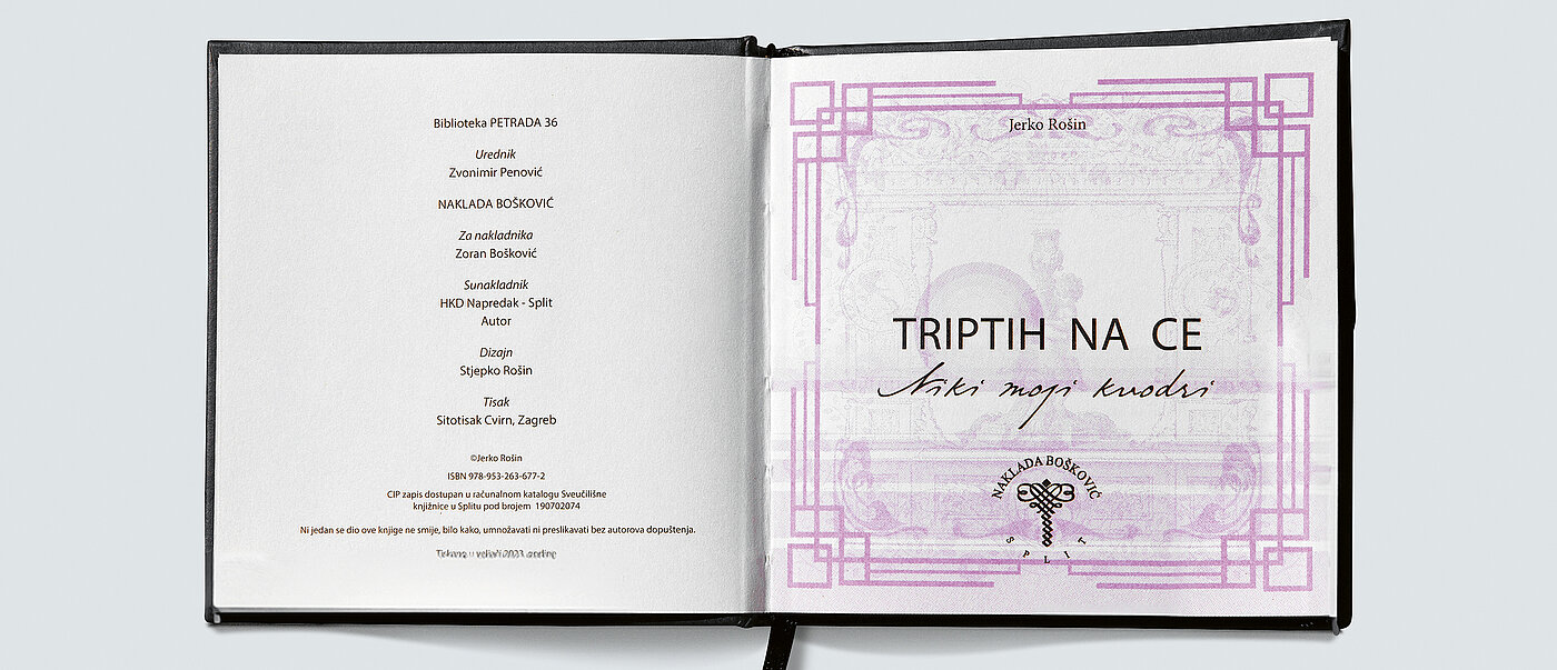
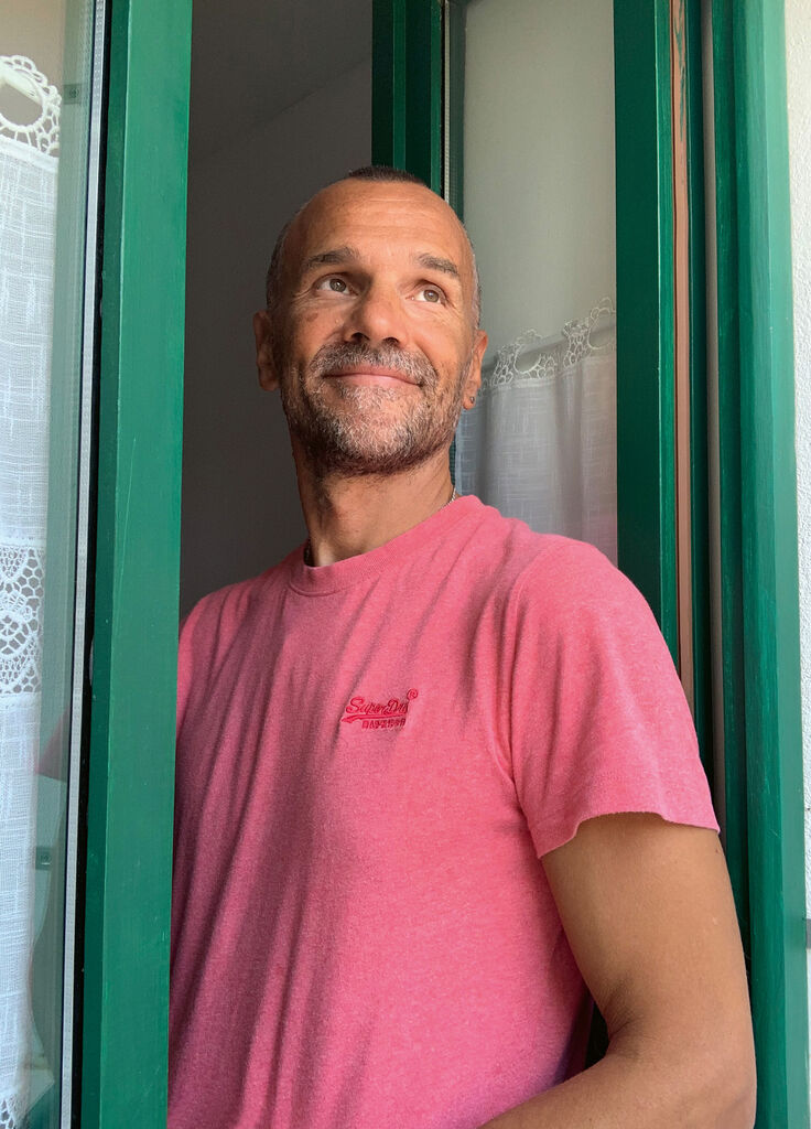
Born in 1972, designer Stjepko Rošin has always been a free spirit, drawn to things that require a little more effort. While studying interdisciplinary design in Zagreb, he quickly realised that his strength lay in industrial design – but he chose graphic design instead. “I’m not claiming this is the only way, but I was too creatively daring to follow anyone else’s method. I immediately chose the more challenging path – the route of a freelancer.” In retrospect, this appears to have been the correct decision. Today, Rošin can look back on countless projects that reflect his keen sense for topics, media and people. “I’m not a bohemian, not a typical designer, and I’m not interested in being the first or the best. It’s merely a short-term event. For me, success is a consistent process of growth and a satisfying feeling of doing something good and valuable,” he says. With this impressive book, Rošin also shows that design need not always be loud. With sensitive typography and a surprising printing technique, he uses the power of print to convey the content emotionally. The collection of poems aims to preserve a Dalmatian dialect from extinction and contains phrases that can only be read when the pages are held up to the sunlight – an interactive approach that encourages reflection and anchors the language in memory.
Interview with Stjepko Rošin
Red Dot: What sparked the idea for this book?
My father Jerko Rošin wrote these poems to preserve the Dalmatian dialect for history. He wanted to capture the spirit of the people through their language and local everyday events. The dialect supports authenticity and is also safeguarded from being forgotten. The free form of the poems reflects the free spirit of the people, for whom the wit of expression and the melodiousness of rhyme are vital. The aim was to draw more attention to the threat of oblivion and to design the book in such a way that it preserves an intangible cultural heritage. This would not have been possible with a classic design approach – it was not about promoting the poet or making a name for oneself as a designer, but about protecting the dialect and the medium of the book.
The design is part of the message here, because the light-sensitive printing colour plays a key role …
I am generally not inclined to use effect for effect’s sake. On the contrary, I always try to make sure that every little line of my design is not an end in itself. The idea of using a light-sensitive ink came to me once my task was clear, not the other way round. Studying the character of a Dalmatian place – the sunniest spot on the Adriatic – and its leisurely population, I realised that I needed something expressive to draw attention. It also needed to be authentic to connect with people on a deeper level. I found this correlation in the sun, or rather in an effect that gives sensory pleasure – like a magic trick that awakens the primal and childlike in us. In this way, the book entertains, describes, educates and warns at the same time.
You opted for a very compact format. What were your reasons for this?
Since a book is read in daylight, a pocket format is easier to carry around, more often at hand and more usable overall. In addition, the form of the poems did not require a larger format – it would have been a waste of paper. The theme requires not the whiteness of space, but sunlight.
What does materiality mean for you and your work in general?
What appeals to me about the design of traditional media in general is the authenticity of perception and therefore haptics. In graphic design, we often only focus on the sense of sight. It would be desirable to think more broadly and deeply in the context of the senses.
Discover other winners


