

Being awarded the Red Dot: Agency of the Year is a very special honour: no agency can compete for this title. The…
Very high-quality design is distinguished by the Red Dot Jury with the Red Dot: Best of the Best. From these projects, they select those to which they award the highest honors: the Red Dot: Grand Prix and the Red Dot: Junior Prize.
They represent the top of international communication design: The winners of the Red Dot: Grand Prix. This year, six works stood out from all the submissions. They were awarded by the Red Dot Jury with the highest individual distinction of the Red Dot Award: Brands & Communication Design. The best work in the junior category was honored with the Red Dot: Junior Prize. This can only be awarded once per competition.
Client:
Forskningsrådet
Oslo, Norway
Design:
ANTI
Oslo, Norway
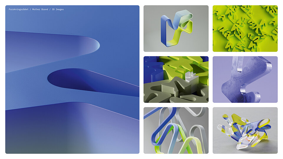
Constantly questioning the status quo, taking unconventional approaches – all this still characterises ANTI’s work to this day. The agency’s name is by no means associated with a rejectionist attitude; rather, ANTI stands for “A New Type of Interference”. Exactly what brands need today more than ever. In this spirit, the agency also developed a well-thought-out and flexible corporate design for the complexly structured Research Council of Norway, which could even be experienced haptically by its employees.
When developing this corporate design, different organisations needed to be taken into account. What were your initial considerations?
When creating identities, we always work very conceptually with storytelling. The key lies in good stories that also have the potential to make good systems. And we always start by understanding our clients comprehensively. As a government agency, the Research Council of Norway operates within strict standards and regulations, but the variety of proposals it receives from different researchers is enormous.This required a system with the potential to allow the development of concepts in all directions. We wanted to find a visual language that was clear enough to be recognised across all forms, while allowing for individual expression.
You used a Dubins path generator for this. Can you briefly explain what that is?
We were looking for a generative system that would support the idea of making connections, which led us to the Dubins path. The generator uses a four-by-four grid, with each grid point representing an area where the research council is working. It selects a series of random points in the grid and uses the Dubins path to connect them, creating dozens of variations that share a consistent aesthetic.
Client:
Army Marketing Enterprise Organization
Chicago, USA
Design:
Team DDB comprised of Siegel+Gale and DDB Chicago
New York, USA
Despite their wealth of experience, there are still exciting challenges for Siegel+Gale. One such challenge is developing new branding for a special client: “The US Army is a unique client – that would probably be the case for any agency. Aside from the camouflage uniforms and other obvious differentiators, there aren’t many other organisations that can boast more than a million employees and 248 years of tradition.” The result is a smart and nifty appearance that ensures an intuitive identification of the army members with the troops – and, of course, the same approach was applied here: simple is smart.
Your brand design for the U.S. Army is very complex. Which component would you call the centrepiece?
The new logo is surely the most visible and iconic element. However, we have also established simple, universal identity principles that inspired all the components and how they work together. These are characterised by clarity, confidence and humanity.
The colours have remained the same as far as possible …
The Army has been using the colours black, gold and white for many years. We added an “Army green” to this palette to give it a unique Army character. Otherwise, we felt the existing colour spectrum was very well thought out in terms of recognition value and the ability to unify the sub-brands.
When developing the brand, the focus was primarily on young adults. How important was it to create an authentic image?
Authenticity was a top priority for several reasons. This identity must tell a frank and engaging story about the wide range of possibilities the Army offers to young people. At the same time, it needs to resonate with current soldiers and veterans who, of course, know the Army better than anyone else.
We decided early on to avoid “inventing” or introducing anything from the outside. The Army has such a rich and distinctive visual culture that every creative decision was inspired in some way by already established features of this brand.
Client:
Atelier Walter Oczlon
Salzburg, Austria
Design:
Atelier Walter Oczlon
Salzburg, Austria
Walter Oczlon is a perfectionist with a passion for the art of book design, for materiality and for craftsmanship. Hence, “Verhüllungen” (Coverings) is not literature for fast consumption, but instead wants to be discovered page by page. After all, it is a 31-metre-long accordion fold book, for which he captured coverings of all kinds in public spaces with his camera.
Over what period of time were the photographs for “Verhüllungen” taken?
Most of them were taken within a three-year period. In the beginning, I had no idea that there would be so many new things to see and discover with this theme.
Did you have a book project in mind from the outset?
Yes! Step by step, motif by motif, I began to engage more intensively with the project conceptually and photographically, while at the same time working out the book concept. My goal was to give the photographic theme an appropriate framework. By presenting the pictures in a long accordion fold, the book itself became an object of concealment – as soon as it is unfolded, it transforms into a wall-filling exhibit.
In the end, you created an accordion fold that is 31 metres long. Were you aware that this was going to be bookbinding madness?
No and yes. My first self-folded dummies were very promising. But they were only three metres long. As the length increased, so did the challenge. It was completely new territory for all of us – the printer, the bookbinder and me – and there were no reference objects. Therefore, it became a long road with numerous print mock-ups on original paper and discussions in the tenth of a millimetre range. In the end, the master bookbinder glued 39 precisely folded and creased printed sheets together by hand to make this accordion fold book – thanks go to him!
Client:
Novartis Pharma AG
Basel, Switzerland
Design:
iart – studio for media architectures
Münchenstein, Switzerland
AMDL CIRCLE and Michele De Lucchi
Milan, Italy
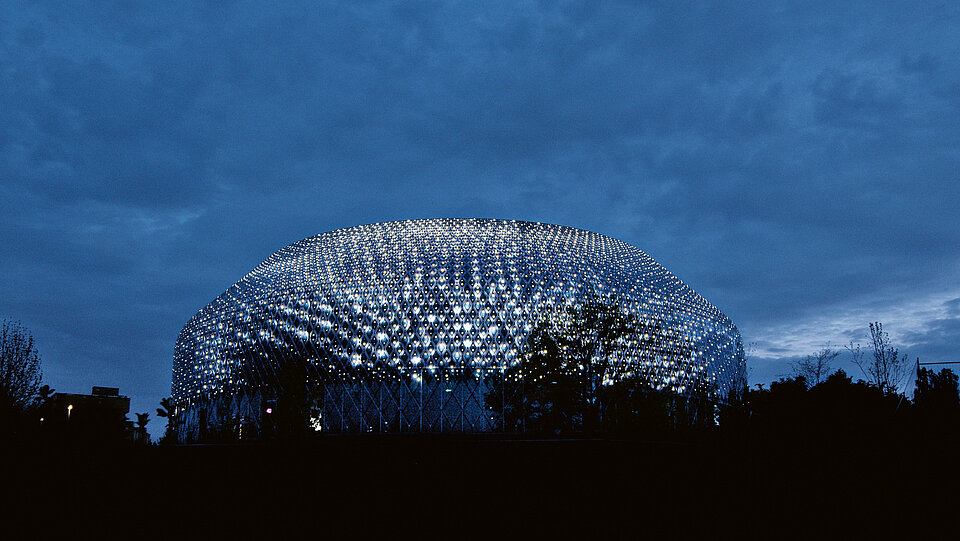
iart’s international implementations have already won various awards, and the Novartis Pavillon in Basel is another beacon project. The 10,000 solar modules not only ensure an environmentally friendly presentation, but also sparkle in the eyes of visitors to the company and the city.
Design and technology are closely linked at iart. Do you generally see this as the new job profile of the designer?
At iart, we don’t distinguish between designers and engineers. We work in interdisciplinary teams. The transition between the disciplines is fluid. Creative engineers play an important role for us because they essentially build the bridge between technology, innovation and design. In addition, collaboration with architects is of central importance, because we understand media facades as an integral part of architecture. In the case of the Novartis Pavillon, we designed the facade together with AMDL CIRCLE, in particular with Nicholas Bewick and Michele De Lucchi.
Equipped with 10,000 solar modules, the Novartis Pavillon produces more electricity than it consumes. How important is the ecological aspect in architecture today?
Sustainability is important in all areas of architecture, including our work. With this project, we wanted to show that a media facade can generate electricity, not just consume it. By combining communication capability and energy generation, we create new possibilities – both in terms of design and sustainability. For us, it is clear that continuous engagement with sustainability is the only possible way forward.
The pavillon is used by artists who developed the motifs together with Novartis scientists. Were there points where compromises were necessary?
The media facade we developed has a lot of design potential, but it also comes with limitations. It is round, has a certain resolution and can display content on both the front and the back. The three artists – Daniel Canogar, Esther Hunziker and Semiconductor – accepted this design challenge very positively. So it was a question not of compromise, but of exploiting the potential of this unique medium.
Client:
Gaggenau Hausgeräte GmbH
Munich, Germany
Design:
1zu33 GmbH
Munich, Germany
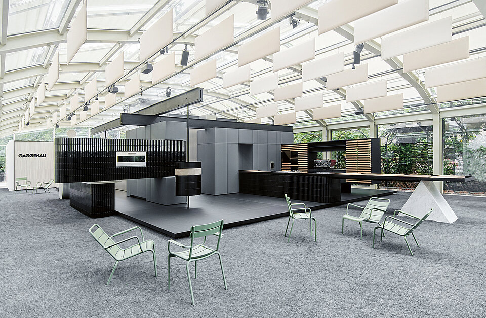
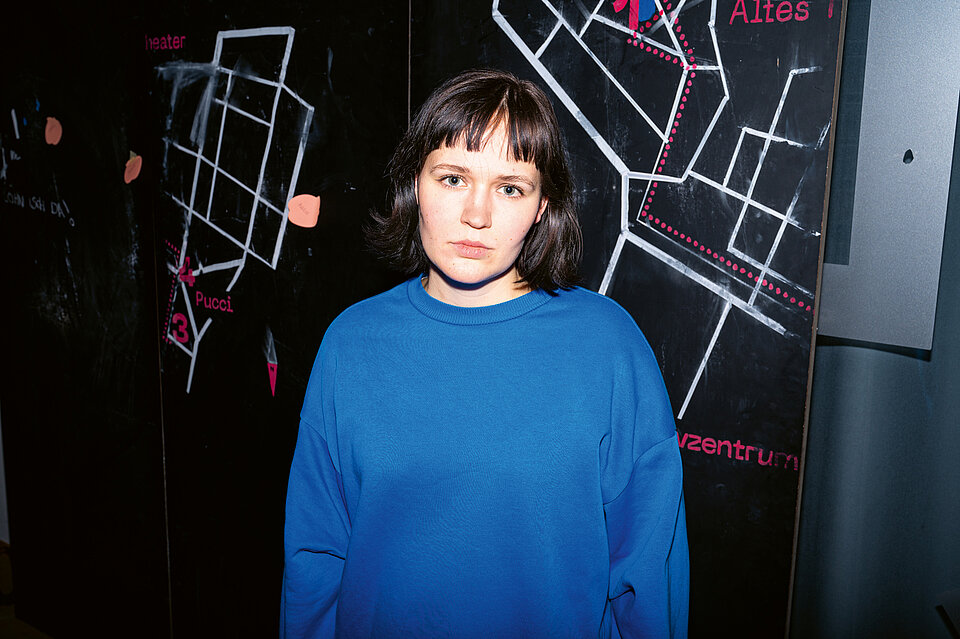
As a studio for architectural brand communication, 1zu33 not only translates corporate values into spaces – it also creates places of encounter where brands can be experienced holistically. In this way, the studio’s passion for details and profound understanding of brands were also manifested in the Gaggenau presentation at the Salone del Mobile. Here, the designers played on the magnificent Villa Necchi, with its 1930s architecture forming an exciting contrast to the modern brand image.
You staged the Gaggenau brand in the Villa Necchi in Milan, with tradition and modernity forming a charming contrast. How difficult was it to interact with this location?
From the very beginning, it was our intention to treat this location with great respect – yet, nevertheless, to develop a bold and independent approach to presenting the Gaggenau brand. Accordingly, we created a concept in which echoes of 1930s architecture in Italy are combined in an abstract spatial installation with the values and characteristic features of the brand to create a unique composition. Finding the right balance was a very challenging process.
Do we perceive spaces differently today than the generations before us?
Previous generations knew primarily physical spaces and imaginary spaces in their range of experience. The newly introduced digital space creates a fresh and highly relevant dimension, but one that is very limited in its experiential content due to its exclusively visual perceptibility. Our desire to experience real spaces in all their sensory appeal is, in my experience, enhanced by this. We see places in digital space that we want to experience in real life. Often we already carry an image within us that we then compare with reality. We photograph these places and then feed our impressions and observations back into digital space, creating a continuous dialogue between the real and digital planes.
Client:
Dot Incorporation
Seoul, South Korea
Design:
SERVICEPLAN GERMANY
Munich, Germany
The Serviceplan Group was founded in 1970 as a classic advertising agency. The concept of the “House of Communication” quickly developed – an integrated agency model that unites under one roof all modern communication disciplines: creative and content, media and data, experience and commerce. This includes brand strategists, creatives, experience designers, experts in media, marketing technology and CRM, data scientists, market researchers, and PR consultants and professionals.
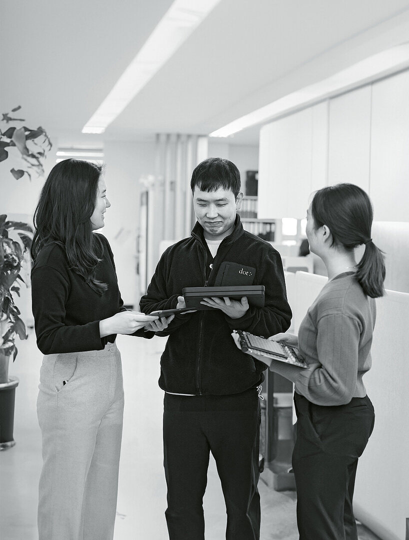
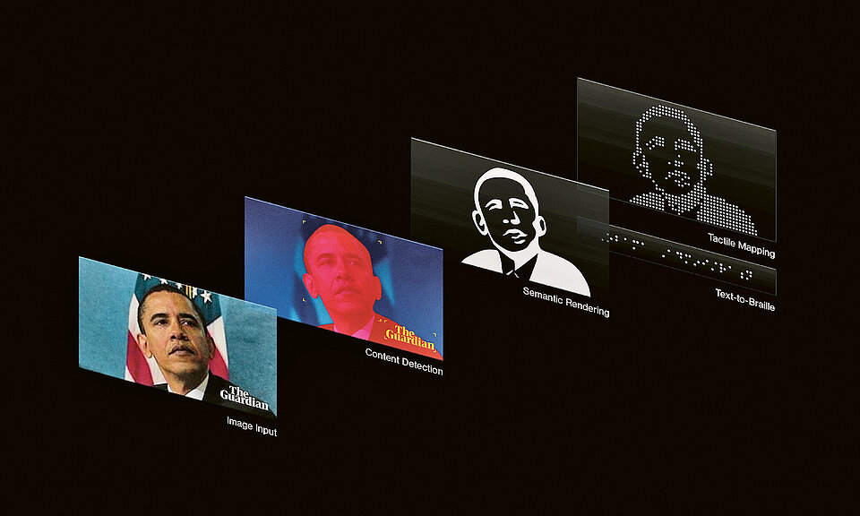
Dot Pad makes it easier for blind or visually impaired people to access a wide range of information.
How did you approach the development process?
We started by talking directly to visually impaired people to understand their daily challenges. Our team of accessible technology experts, including engineers, designers and accessibility consultants, aimed not only to meet existing needs but also to anticipate future ones. Together with Braille teachers and accessibility specialists, we wanted to ensure that this device would promote independence, education and communication. We continue to be in constant contact with users to further improve the device features through feedback from the visually impaired community.
Using AI, Dot Pad transforms visual information. Can you briefly explain how this works?
The process starts with the capture or input of a visual image – be it a diagram, a photo or even illustrated text. The Dot Image Processor uses AI to analyse this image. This includes segmenting various elements in the image, such as shapes, lines, text, patterns, background, foreground, etc. It then extracts the most important features and translates them into a tactile format.
What content can be transferred to Dot Pad?
Dot Pad is very versatile and can convert a wide range of visual information into tactile graphics and Braille representations. This includes images, text, diagrams, maps, mathematical notations, symbols, educational material, graphical information, artwork and descriptions of digital media.
Design:
Marie-Luise Charlotte Weier
Bad Neustadt, Deutschland
University:
DHBW Ravensburg, Studiengang Mediendesign
Ravensburg, Germany
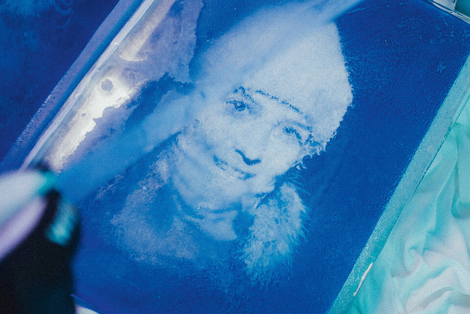
“Snow flurry” is the translation of the Finnish word “pyry”, which Marie-Luise Charlotte Weier chose as the title for her remarkable work. Indeed, one has to dress warmly when looking at her impressive photographs: frozen book pages allow the beauty of the Arctic Circle to shine through a thin layer of ice while symbolising its fragility.
Did you consciously choose risography for the presentation in book form as a particularly sustainable printing technique or because of its aesthetics?
The environmental aspect should play a role in every print and presentation. For the ice book, the loose colour particles of the risography also became an analogy for the transience of snowflakes. By separating the colours, I came up with the idea of printing the front in steel blue in a single colour, and the back in marine red, aqua or sunflower in two colours. In this way, the translation of the hard, extreme moment of freezing succeeded – so only in retrospect, when turning the page, does the whole picture emerge. The trickiest part was certainly the astonishing coating with ice.
How was this technically realised?
It was a long process of experimentation, patience and repetition. In the Arctic Circle I had taken part in a course on designing and building ice sculptures, which at least opened the doors for me to ice as a material. But the ice pages, the frozen photographs, were the easier part. The most difficult aspect was the binding: the book had to be stable, meaning that the pages must not break or freeze together.

