

“The loudest thing is not always the right thing.” – Interview with sound designer Rainer Hirt

When you tell non-designers in your circle of friends that typefaces are also judged in the Red Dot Design Award, they always look at you with perplexity: aren’t there already enough different fonts out there, is it even possible to invent something new?
Yes, you can – if you are willing to look beyond the horizon of the known typographic world and enjoy discovering new territories along the way! Monotype is a regular winner of the competition, and the famous type foundry has often won the coveted red dot. Their work is often characterised by a great attention to detail and outstanding quality. Reason enough to take a look at some of the winning entries from previous years.
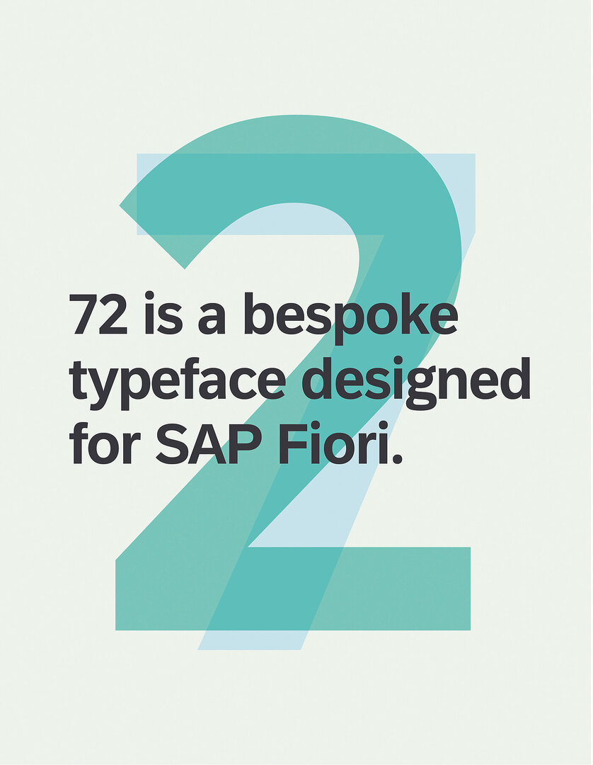
On the one hand, there are fonts designed for businesses. One example is Font 72, which was developed specifically for SAP’s Fiori platform.
Its name derives from the year 1972, when SAP was founded. For the specific requirements of screen use, 72 relies on open letter forms that do not visually taper in small proportions, such as the inner space of the letters c or e. Even the l - the small L - can no longer be mistaken for a vertical stroke due to its rounding at the foot. Such aspects of good legibility are important not only for accessible or low-barrier digital applications. At the same time, the typeface has an individual and modern feel, especially when compared to the Arial typeface used previously.
With seven different weights and numerous international characters, 72 opens up new aesthetic possibilities for users of the Fiori user interface.
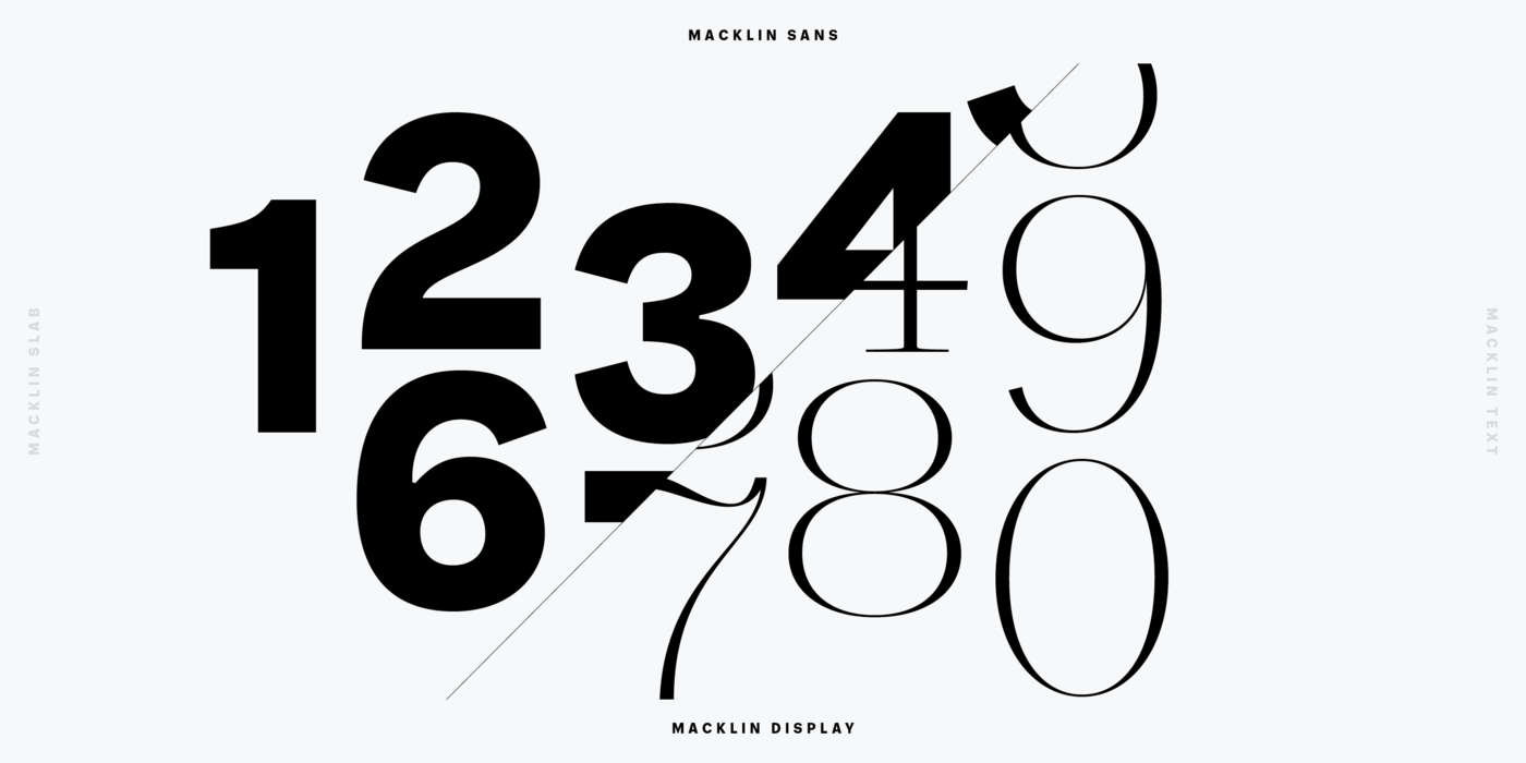
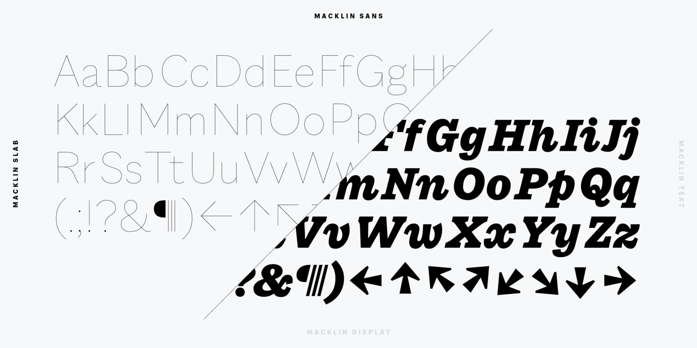
A very different example is the Macklin family, designed by Malou Verlomme.
Verlomme was inspired by the legacy of British type founder Vincent Figgins (1766-1844) and has brought the sensuality of his amazing work into the present day. In four categories (Text, Display, Slab, Sans), a total of 54 fonts in nine weights offer almost endless combination possibilities. The accentuated contours, sharp edges, and finely balanced weights give Macklin a unique elegance that works beautifully in both headlines and body text.
Among my favourite letters are the “7” and the “C” set in Macklin Pro Slab.
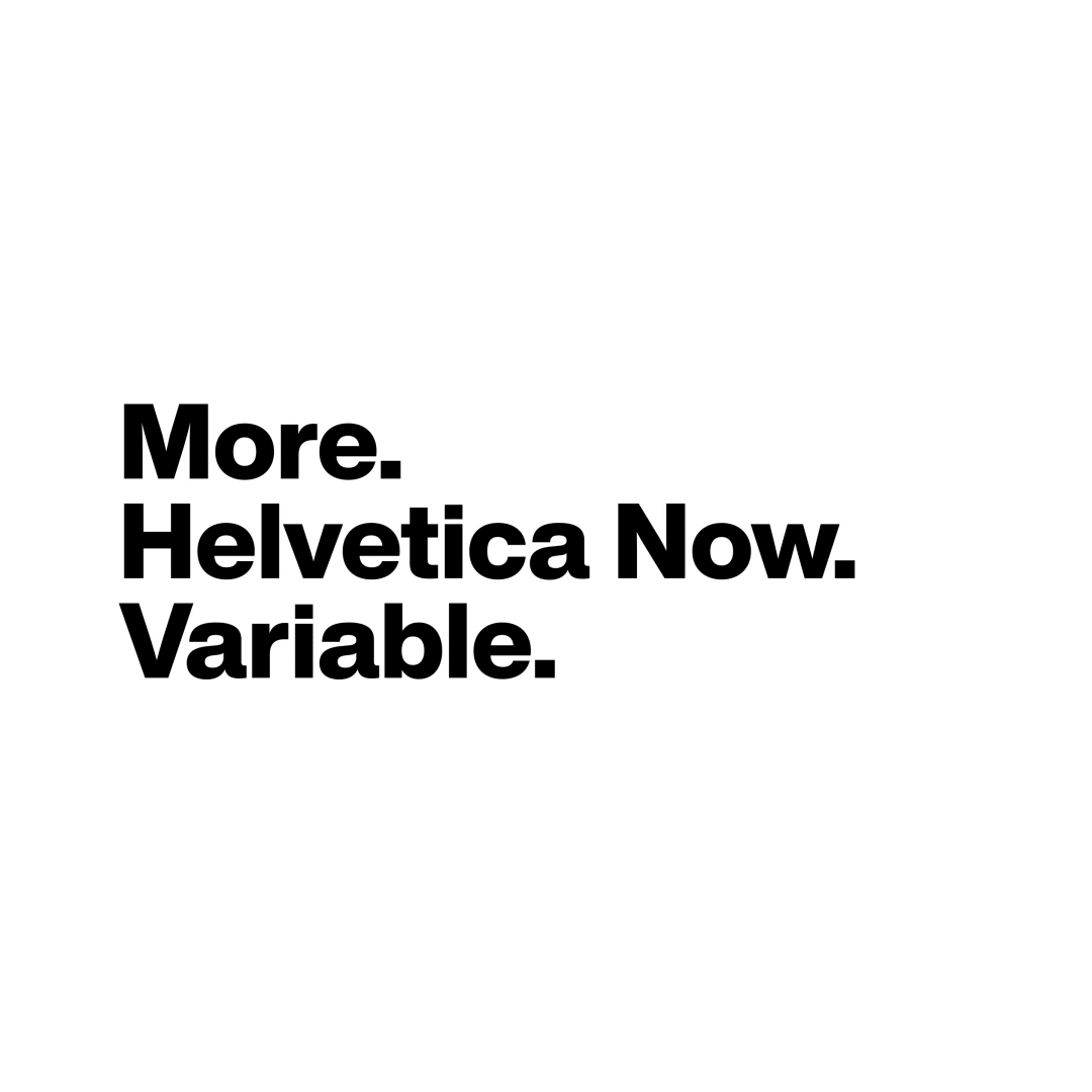
Helvetica was originally released in the 1950s as one of the most popular typefaces. Then, in the mid-1980s, Neue Helvetica came onto the market.
Didn't this already provide all the typefaces needed? Why was this typeface still being intensively studied in the 21st century? The answer is simple: a digital response to the analogue original was needed, and Helvetica Now was born. The typeface now includes more than 400 glyphs (in all weights), as well as matching arrows and numerous alternate glyphs that open up new possibilities for designers. For example, there is an uppercase G or a lowercase u without a drop if design expression is desired, a micro version for small print, and a display version for large print. The letterforms and spacing are designed to look good in print and on screen.
As judges, we were impressed by Monotype's mastery in breathing new life into a well-known typeface personality, and so the typeface was awarded a Red Dot: Best of the Best in 2019. Incidentally, three years later, Monotype received Red Dot for Helvetica Now Variable.

How far can we go? That was the question at Monotype’s TYPO Labs 2018, an industry gathering of typography and technology professionals.
And just how far you can go with type is demonstrated by the typeface Olli Meier created for the event: a sans-serif, variable typeface that can be adapted to all conceivable formats, with the height, width and thickness of the letters adjustable at will – in this case, deliberately to the limits of legibility.
Seamless font technology was still quite new at the time, so it lent itself to the visual identity of the “TYPO Labs”. The result was exciting surfaces, some of which were only recognisable as letters or numbers through fine strokes, and animations in which individual parts of words seemed to struggle for space. Some words looked almost like barcodes, others puffed up like balloons – an exciting experiment that made type a lot of fun.
After working as an Art Director in various companies, Thilo von Debschitz founded the design agency Q in Wiesbaden together with Laurenz Nielbock in 1997. Since then, the agency has received numerous international awards. In addition to his agency work, Thilo von Debschitz writes books with a focus on visual art. He attracted great attention with the rediscovery of the infographics pioneer Fritz Kahn and the publication of a monograph dedicated to him. Thilo von Debschitz taught at the RheinMain University of Applied Sciences and at the Institute for Marketing and Communication in Wiesbaden. Today he is also a regular guest speaker on the subject of design at conferences.
![[Translate to English:]](/fileadmin/_processed_/d/0/csm_Teaser_Print_1_3863dc4235.jpg "[Translate to English:]")
