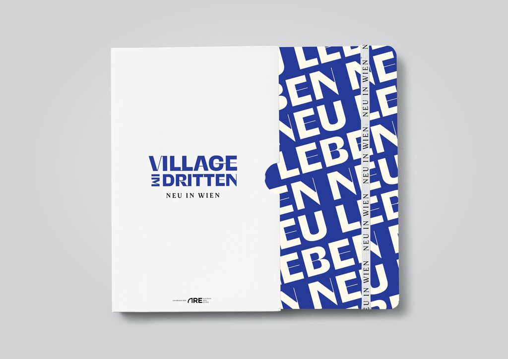
corporate design

Fedrigoni Hotel Book

Back Download

The aim of this lavishly designed, bilingual image brochure was to convey an elusive home-away-from-home feeling to hotel guests. The design concept is inspired by the visual and haptic properties of paper, complemented by artistic punch-outs that enhance the harmonious colour combinations – with the cover featuring a letter “H” for hotel, unveiling the colour surfaces of the pages underneath. Inside this hotel book guests will find, among other things, a personal note upon arrival, restaurant menus, and information on the city. An appealing page layout underlines the upmarket character of this limited edition book, which realises an array of different themes on an assortment of 50 paper variants.

Red Dot

Others interested too