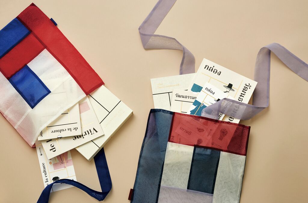
Client: Fortuna Düsseldorf 1895 e.V., Düsseldorf, Germany
Brand Design
Satoyama Marugoto Hotel
The Satoyama Marugoto Hotel community in Japan offers a sustainable tourism concept based on local cuisine, spa elements and an architecture-focused sightseeing programme. As a result, its logo is inspired by the shape of the mountain as well as the roof of a traditional building and the typical rice ball. The artful calligraphy also conveys the hotel’s unique selling proposition. The emotionally appealing brand colour was chosen to underpin the harmonious co-existence of nature and human life. The warm, rust-coloured hue is in stark contrast to the indigo colours otherwise preferred in the Japanese catering industry.
Credits
-
Client:Hyakusyonokurashi Co., Ltd., Ishikawa, Japan
-
Design:Sunpono, Tokyo, Japan