
Interview with Pollinate Labs
As Scandinavia’s leading design agency, NORD ID develops intelligent brand strategies that are reflected in every medium, every interaction, every touchpoint and every customer experience. Guided by the credo “Growth by Design”, the 46-strong team was tasked with breathing new life into the long-established company SKF. With subtle interventions and a striking corporate font, the team prepared their brand identity for the future.
Red Dot: What requirements did SKF place on the new design?
The redesign needed to reinforce the perception of SKF as a premium business at the forefront of innovation and sustainability, while maintaining its unique heritage. The design also needed to reflect the company’s pioneering past as well as its future vision, optimised for digital communication. SKF felt undervalued: potential employees, investors and the industry too often saw the company as a “commodity provider” rather than as a cutting-edge technical innovator.
How difficult is it in general to find a balance between maintaining recognition and creating something new?
It depends on the strategy and the overall vision, whether it calls for a complete repositioning with a full redesign, a redefinition or the reinforcement of a brand. In SKF’s case, it was the latter: to strengthen the brand and position it for the future. After a thorough analysis, it was clear that both the SKF logotype and the colour palette needed to be carried forward. The logo in particular visually embodied the company’s visionary and trailblazing soul, so the decision to modernise and elevate it was an easy one.
Was retaining the logo challenging?
Actually, it wasn’t. We immediately realised that we had a true icon on our hands – an acronym that, despite being drawn by hand over a hundred years ago, embodies both modernity and progressiveness. It feels just as exciting and visionary today as it did 117 years ago, visualising the advent of new technologies and great technological leaps. The challenge lay in refining the logotype for the digital and motion-driven era we live in, without losing its character.
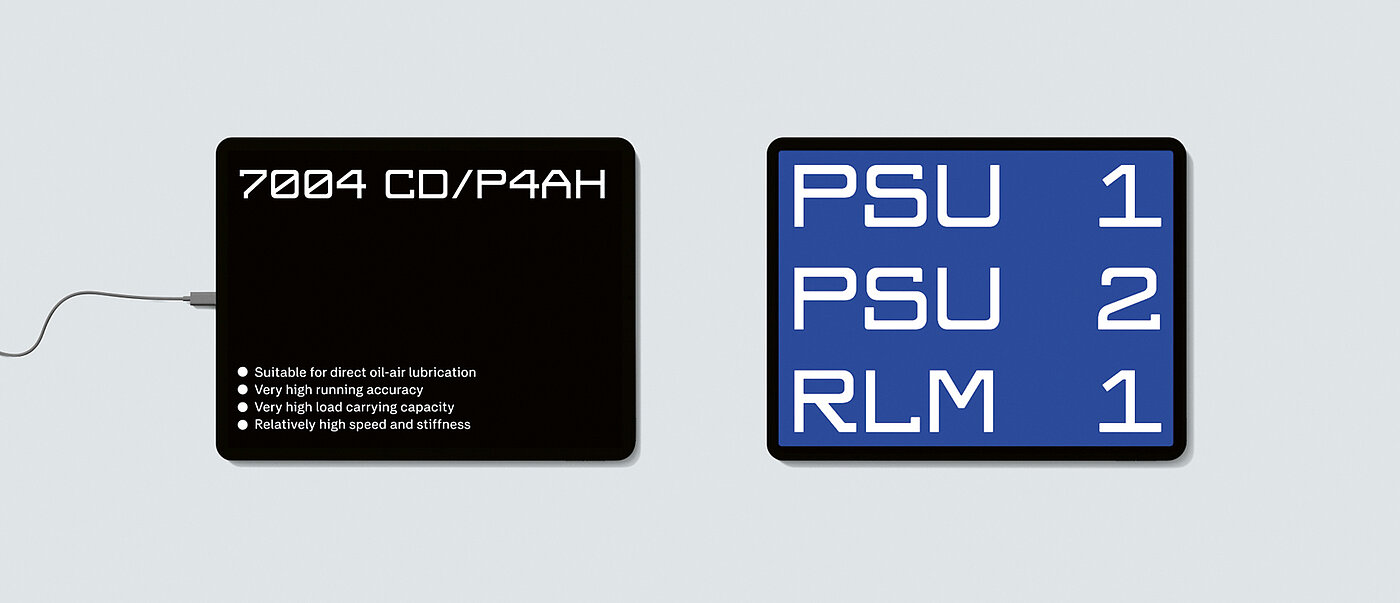
How did the development of the SKF display and the bold colour palette come about?
In SKF’s iconic logo, we immediately saw an opportunity to extend the acronym into a complete headline typeface that would convey the same strong brand recognition. To preserve its distinctive character, we broke away from traditional ideas of the “correct” way to design a typeface. By incorporating unexpected details and slightly uneven forms, we struck a careful balance between maintaining the logotype’s uniqueness and ensuring readability. Keeping blue as the brand colour was a given, but it needed a refresh and to be made brighter. At the SKF factories, we noticed vivid yellow guardrails, orange signs and red buttons that bring the environment to life. We incorporated a selection of these colours to complement the blue and enrich the overall brand palette.

