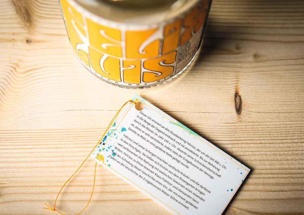
Brand Design

ACRO

Back Download

As a leading construction company for exclusive high-rise buildings in South Korea, ACRO launched a flexible brand identity that underlines the concept of contemporary minimalism. The solid black brand logo was made even bolder to represent the brand’s high-end nature, while its symbolism was strengthened by resetting the proportions. The straightforward colour palette uses a deep black to express the essential aspects of the brand and leaves a lot of white space when shaping customer experiences. The monogram underlines the brand’s prestigious aspirations and showcases appealingly stylish lines.

Red Dot

Others interested too