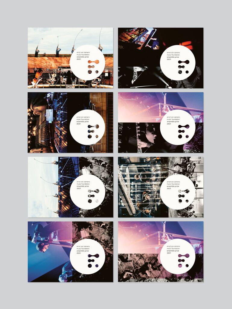
Corporate Design,Visual Identity

Aquality

Back Download

The Self Club is a unique Moscow sports complex with a large and specially equipped swimming pool. Investigations focused on how to attract new visitors and members initially revealed that almost half of the people in Moscow feel unconfident when they come to swimming pools, embarrassed when they undress and even ashamed of their alleged physical imperfections, including possible disabilities. In order to create a visual identity and communication that would convey an atmosphere of friendliness and ease, the new design promotes a wide range of programmes for people to choose from, encouraging them to try the different courses and water classes. Featuring a visual language in red and different shades of blue alongside many cheerful looking balls, the application of the new identity is built around simplicity and irony aimed at breaking barriers and communicating that water makes things easy and people the same. Playing with the physical properties of water, with optical illusions and the dynamics of objects, the Self Club thus announces itself as a “believe in yourself” and “love yourself” club.

Statement by the Jury

The corporate identity for the Self Club swimming club in Moscow succeeds in conveying the services of the club and the quality of water sports in a highly vivid and appealing manner. The reduced colour palette used for this purpose, the simple imagery based on the classic shapes of square, ball and triangle, and above all the subtle sense of humour all combine to merge into a harmonious and convincing unity.

Red Dot: Best of the Best

Others interested too