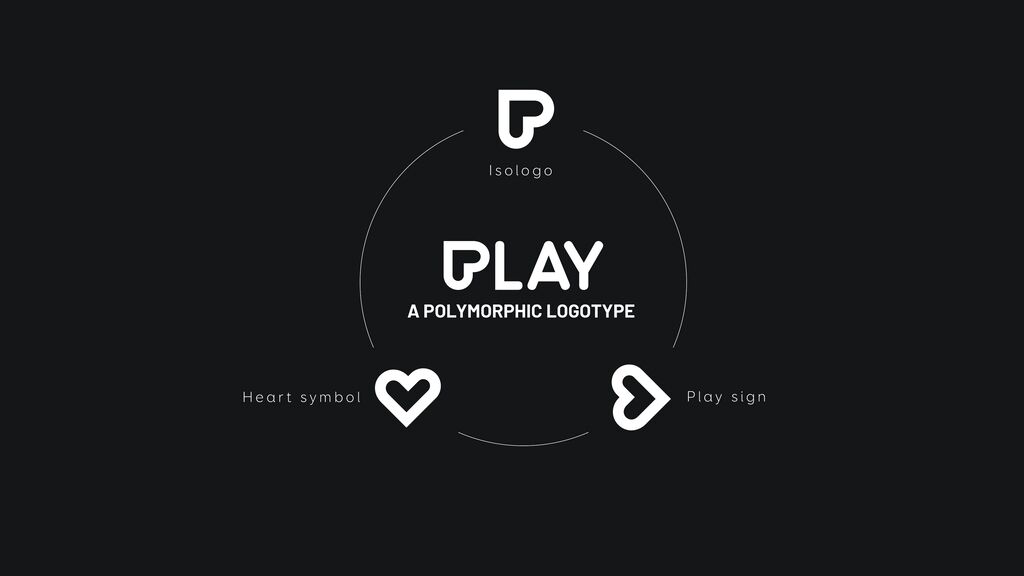
Brand Design

Manufakturwerk

Back Download

The premium concept store Manufakturwerk in Hamburg serves as a platform for handmade products. Its brand design emphasises their exclusivity and attracts the attention of potential customers. In a highly abstract manner, the design of the signet combines the first letters of the two nouns “Manufaktur” (factory) and “Werk” (plant), of which the word mark is composed. In addition, the signet is reminiscent of the letter “H”, which stands for Hamburg. The signet has a strong symmetry that arouses curiosity. Its simplicity is transferred to the entire brand identity, with clear surfaces and black-and-white colouring.

Red Dot

Others interested too