Interview with Beijing Jiaotong University and Central Academy of Fine Arts
or copy the link
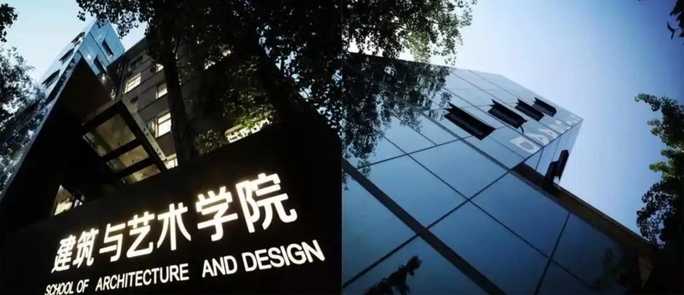
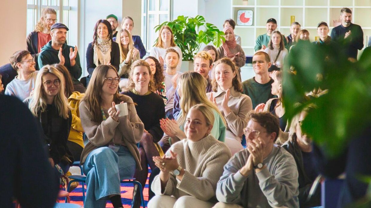
The School of Architecture and Art at Beijing Jiaotong University is notable for its unique Transportation + Design programme, which centres on eco-cities, the protection of historic monuments, and public transport-oriented urban development. By using laboratories in the United States and Europe, as well as the university-affiliated design institute, the school is able to relocate teaching to the project site. Bachelor students benefit from a one-to-one mentoring programme, while master’s students are supported by both a mentor from the university and a company.
About Beijing Jiaotong University and Central Academy of Fine Arts
Adhering to the school motto “Know and Act”, we advocate that “Those who know start to act, and those who act achieve knowledge”. We aim to cultivate future designers who are bold in thinking and action, and who are down to earth.
Yangmin Wang
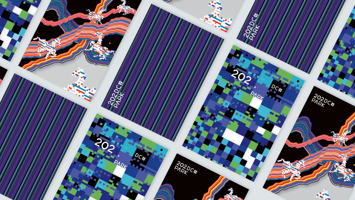
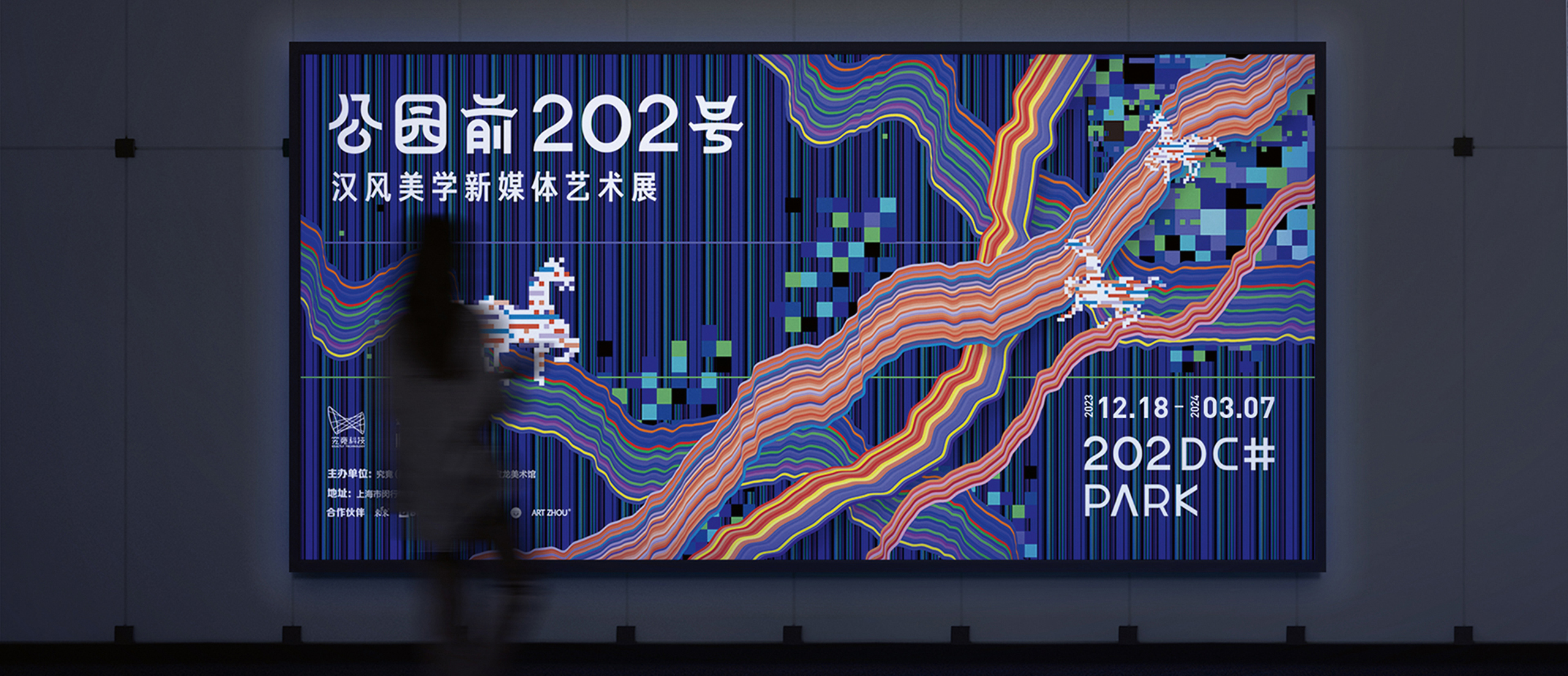
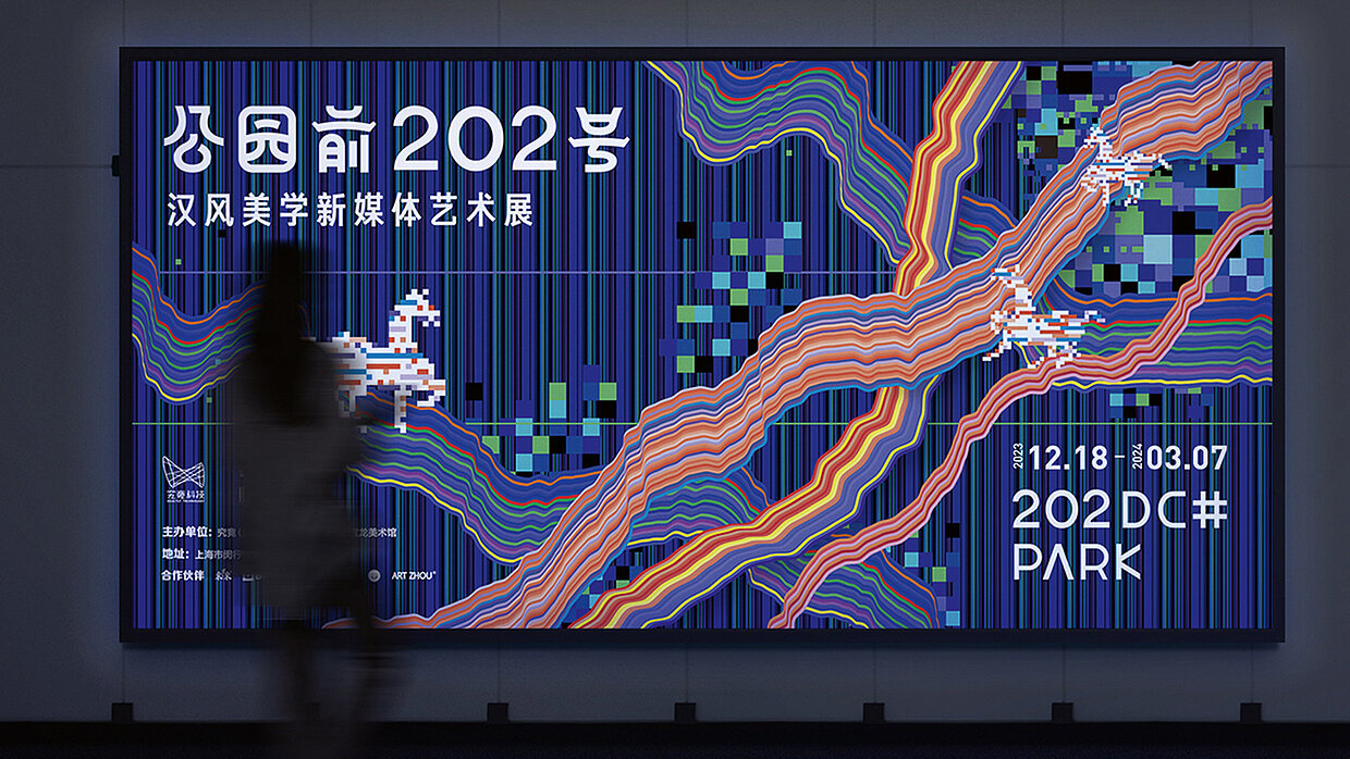
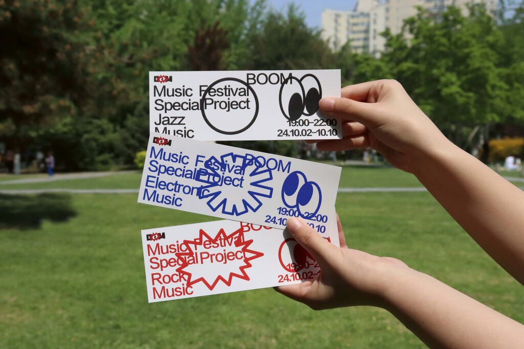
The exhibition “202DC# Park” transposes the culture of the Han dynasty into a multimedia experiential space, using a dynamic pixel aesthetic to forge a bridge to the past that allows visitors to engage with history.
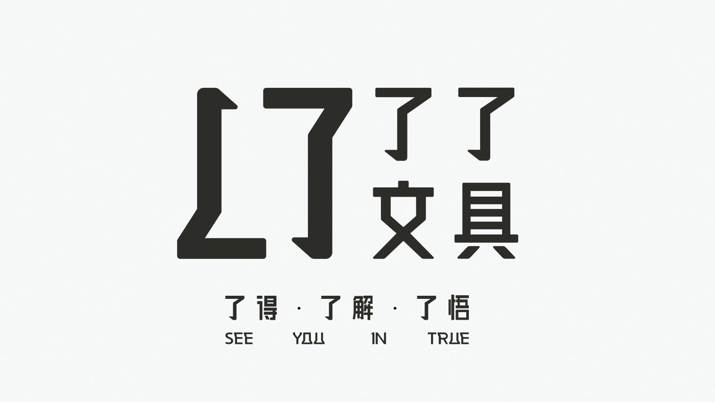
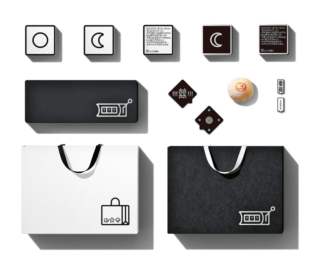
With its restrained, black-and-white visual identity, the branding for Liao Liao Stationery reflects the search for inner clarity. The logo, which consists of two L shapes that mirror each other and was inspired by the Chinese character LIAO, functions as a versatile communication frame that adapts flexibly to different products and formats. A uniform typography is combined with minimalist layouts and three clearly defined product lines to create a calm brand identity whose design promotes self-...
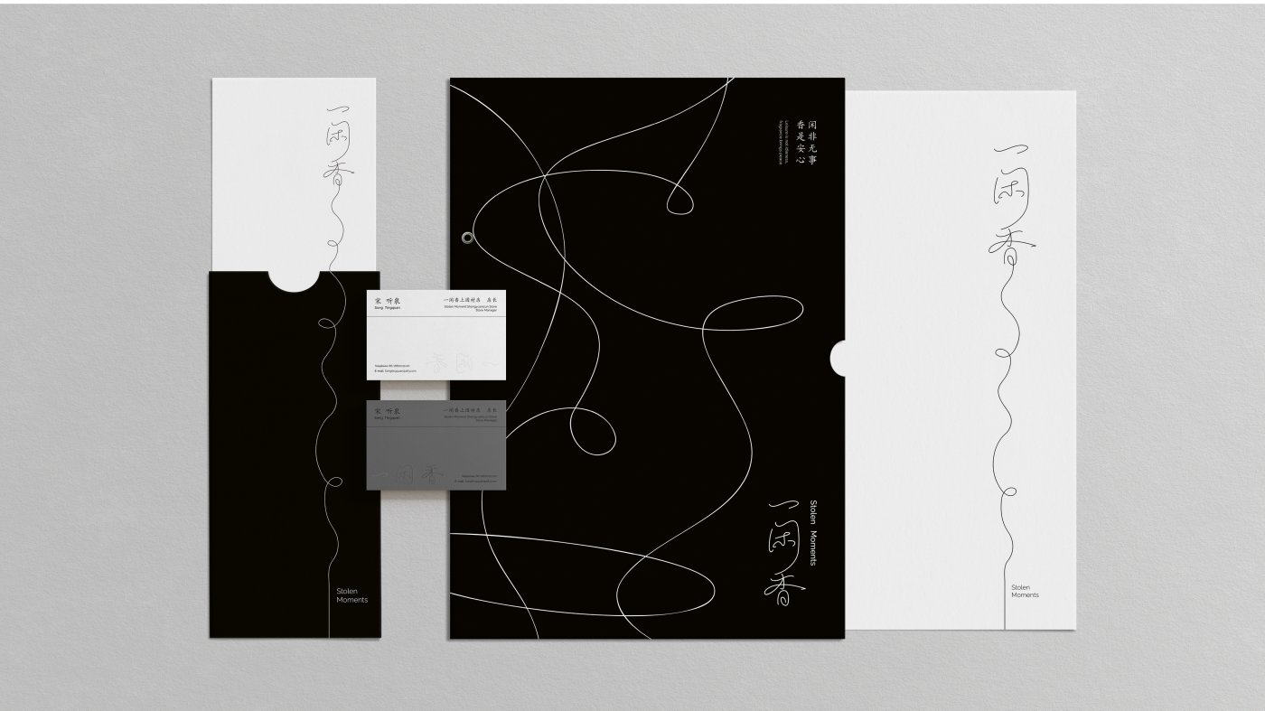
With its clear, calm line drawings inspired by rising smoke and “floating thread” calligraphy, the visual appearance of the Stolen Moments incense stick brand conveys the concept of a brief respite from hectic everyday life. The Four Seasons range and its packaging are characterised by seasonal motifs and varying line thicknesses.
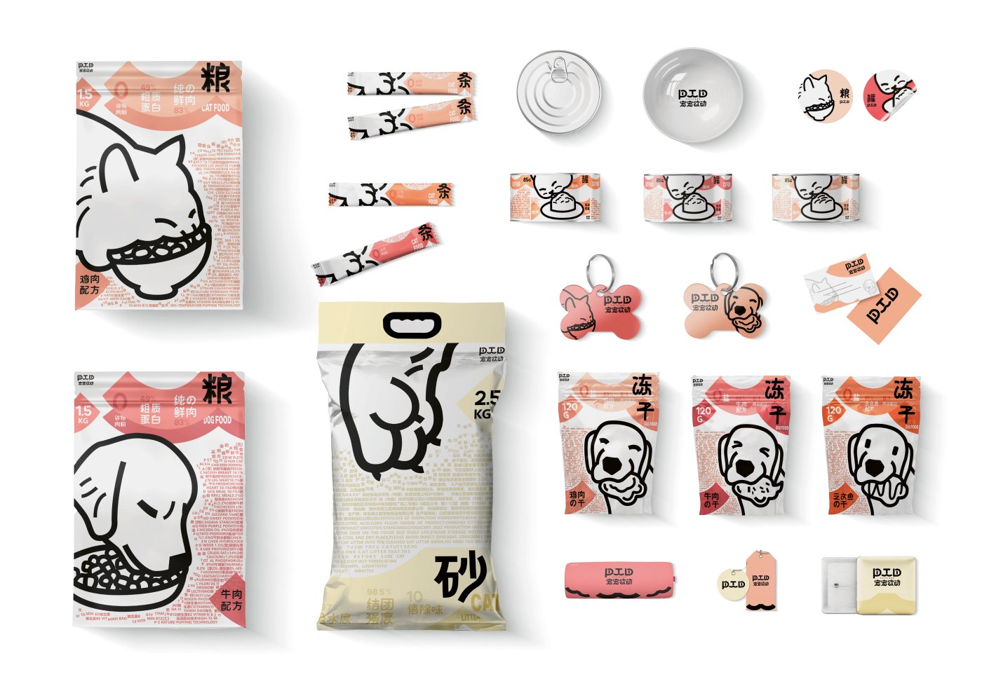
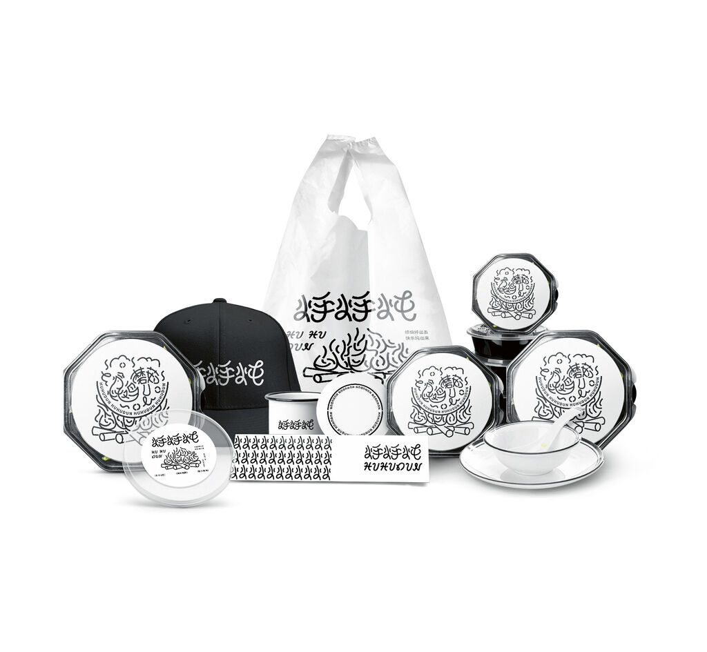
Pet To Do’s brand design is defined by its clean, emotionally appealing aesthetic. Minimalist line drawings of typical cat and dog scenes combined with dots and shapes dominate the appearance, while reduced lines, exaggerated silhouettes and colour-coded information create a visual hierarchy for better consumer orientation.
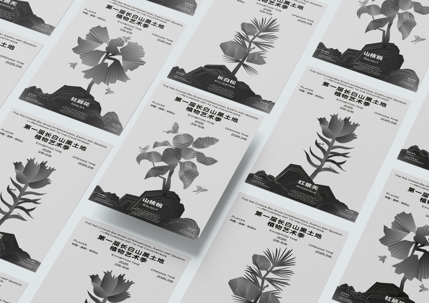
The brand design of the Changbaishan Black Earth Botanical Art Season translates the distinctive landscape of the Changbai Mountains into a visual identity that uses natural shapes in its artistic imagery. The organic design, which integrates undulating rock reliefs, regional materials and motifs of local flora and fauna, extends across all media.
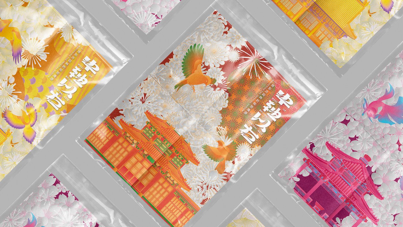
“West of the Central Axis” is the brand of Zhongshan Park in Beijing. With creative products and a distinctive signposting system, it conveys the park’s deep-rooted cultural heritage.
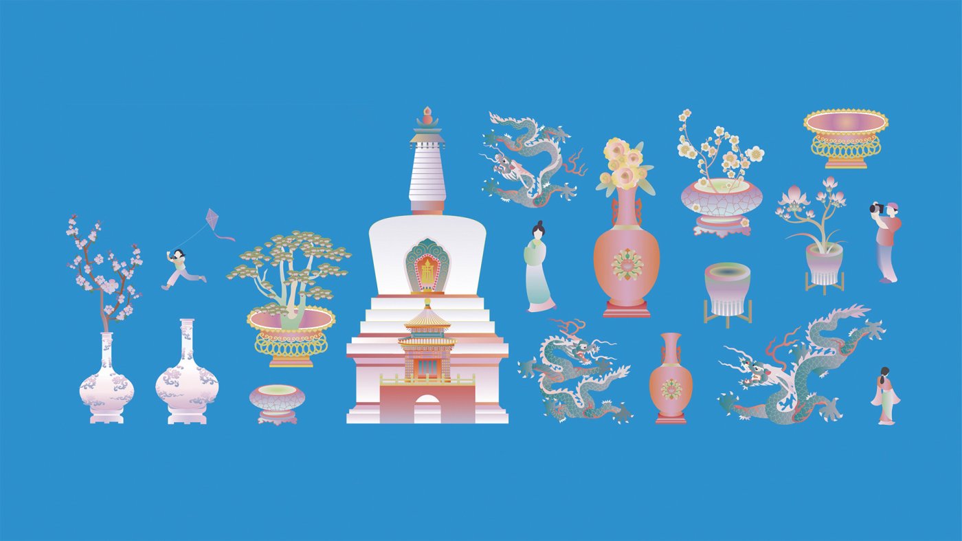
To mark the 860th anniversary of Beihai Park in Beijing, a fresh brand design was created. Inspired by the park’s central features, it gives the historic garden a vibrant, new look.
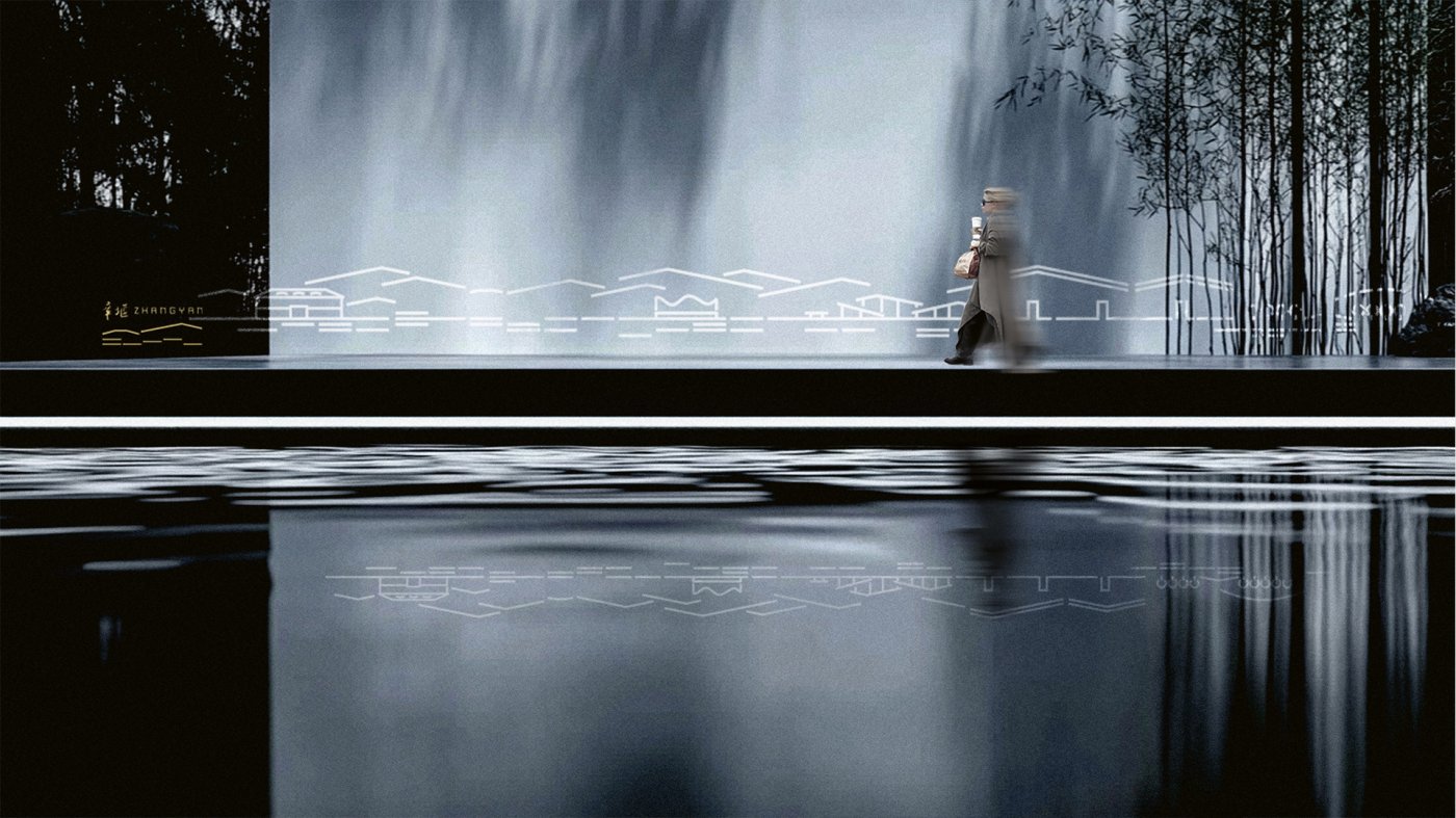
The brand design for Zhangyan Village bridges tradition and future: the undulating roofs, bridges and water symbolise the characteristics of the village, while the clean lines embody modern growth.
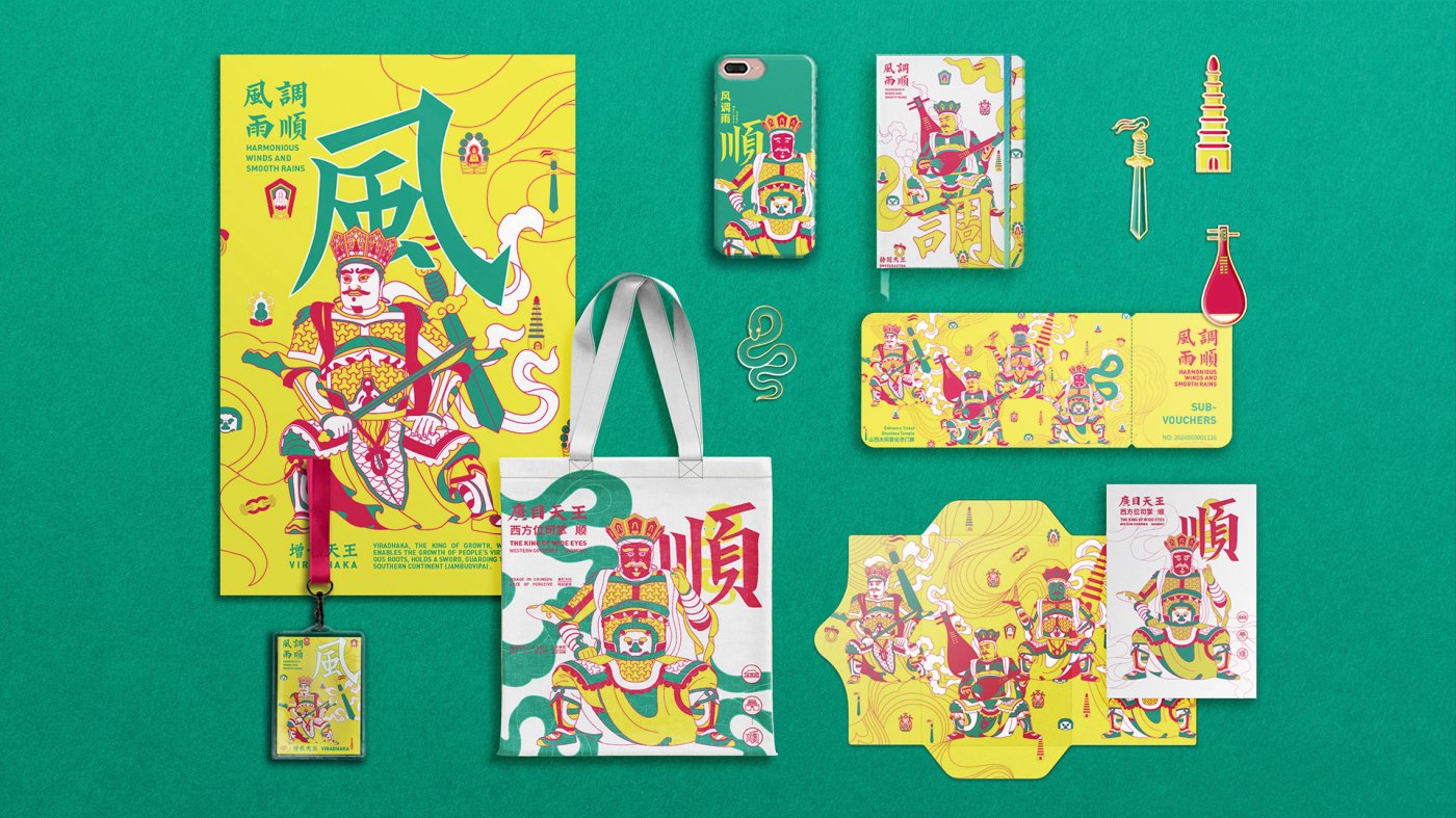
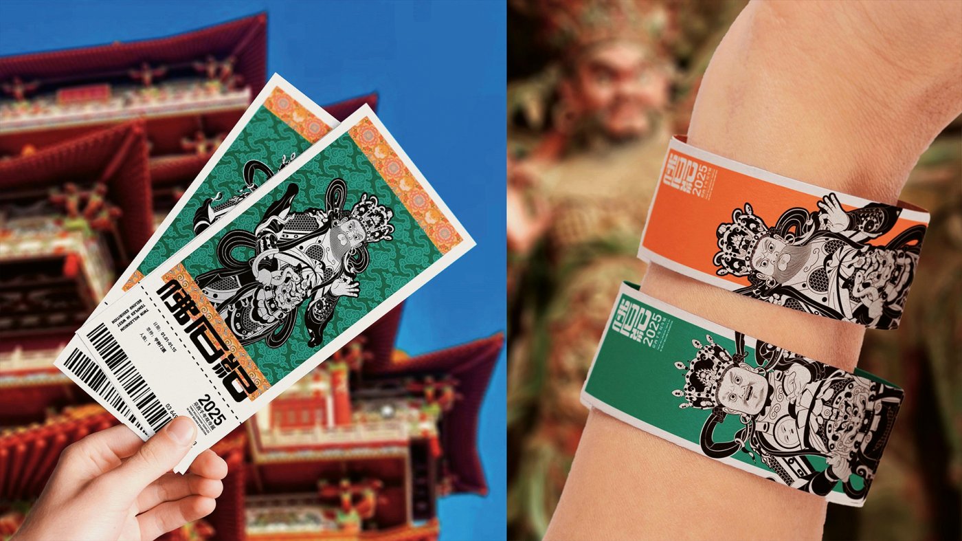
“Favorable Weather for Crops” reinterprets the four heavenly kings of Shanhua Temple in Datong. Bright colours and traditional characters combine heritage with modernity.
The exhibition “Buddha and Stone Memories” showcases the stone-sculpture culture of the Wuta and Dahui temples. Colourful visual elements from both temples create a striking external effect.
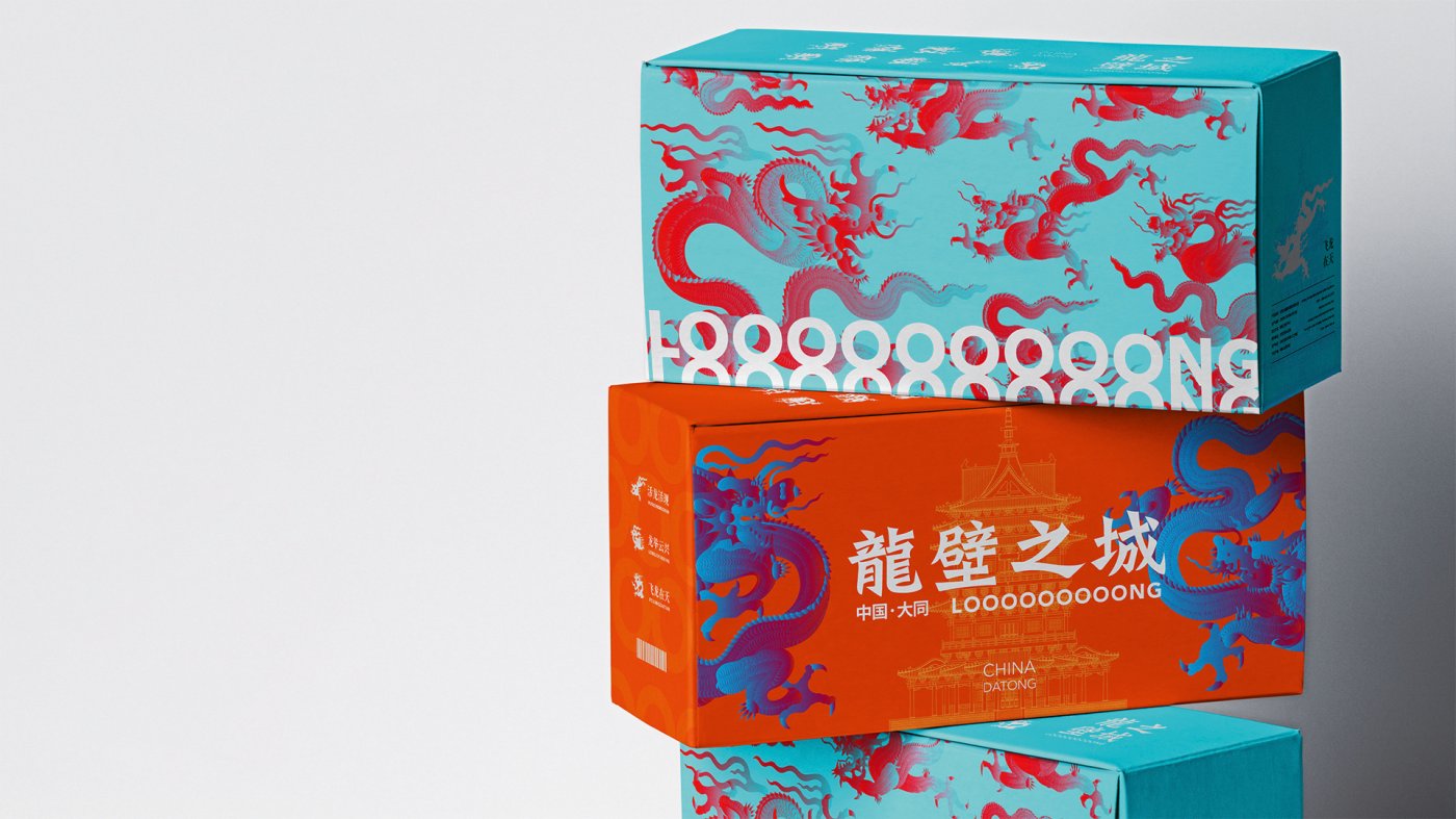
The project illustrates 30 locations in the ancient city of Datong. The eye-catching packaging combines the dragons of the famous Nine Loong Wall with buildings in the city and the “LOOOOOOOOONG CITY” logo.
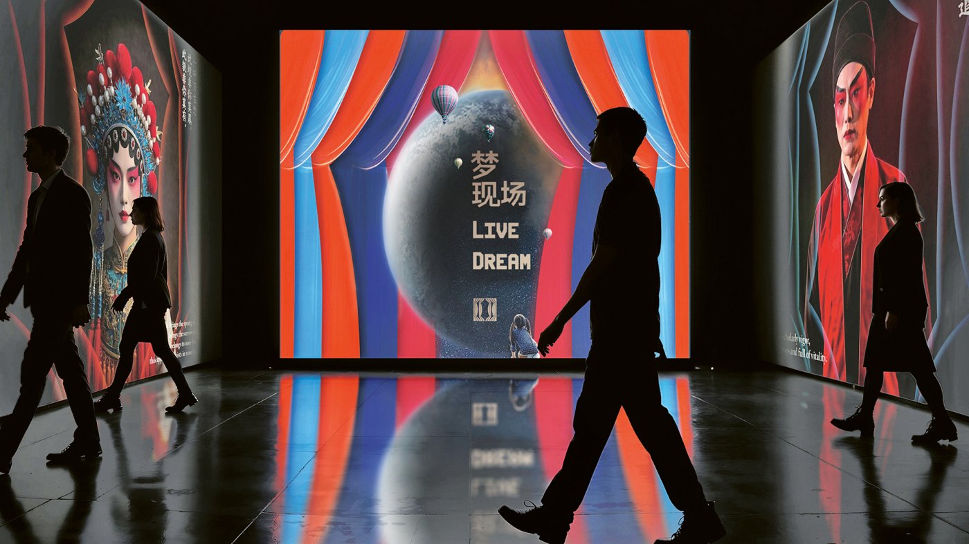
The brand design for “Live Dream” stands for modernity and creative innovation. The variable logo, inspired by stage curtains, sets new trends in theatre culture.
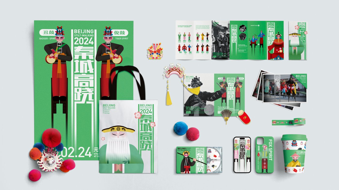
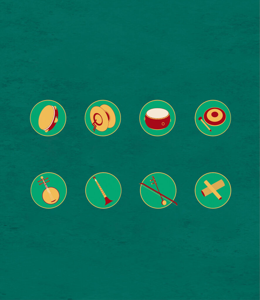
For the 2024 Spring Festival, the culture of stilt walking in Beijing was presented in a modern way: with intuitive visual forms that integrate cultural elements such as history, techniques and costumes.
Brand Design & Identity
Red Dot 2022
Spatial Communication
Red Dot 2022
Brand Design & Identity
Red Dot 2023
Brand Design & Identity
Red Dot 2023
Brand Design & Identity
Red Dot 2023
Brand Design & Identity
Red Dot 2023
Brand Design & Identity
Red Dot 2023
Brand Design & Identity
Red Dot 2023
Brand Design & Identity
Red Dot 2023
Brand Design & Identity
Red Dot 2023
Brand Design & Identity
Red Dot 2023
Brand Design & Identity
Red Dot 2023
Brand Design & Identity
Red Dot 2024
Brand Design & Identity
Red Dot 2024
Brand Design & Identity
Red Dot 2024
Brand Design & Identity
Red Dot 2024